pacman::p_load(plotly, ggtern, tidyverse)Hand-on exercise 5 Visual Analytics
1. Creating Ternary Plot with R
1.1 Overview
Ternary plots are a way of displaying the distribution and variability of three-part compositional data. (For example, the proportion of aged, economy active and young population or sand, silt, and clay in soil.) It’s display is a triangle with sides scaled from 0 to 1. Each side represents one of the three components. A point is plotted so that a line drawn perpendicular from the point to each leg of the triangle intersect at the component values of the point.
In this hands-on, you will learn how to build ternary plot programmatically using R for visualising and analysing population structure of Singapore.
The hands-on exercise consists of four steps:
Install and launch tidyverse and ggtern packages.
Derive three new measures using mutate() function of dplyr package.
Build a static ternary plot using ggtern() function of ggtern package.
Build an interactive ternary plot using plot-ly() function of Plotly R package.
1.2 Installing and launching R packages
For this exercise, two main R packages will be used in this hands-on exercise, they are:
ggtern, a ggplot extension specially designed to plot ternary diagrams. The package will be used to plot static ternary plots.
Plotly R, an R package for creating interactive web-based graphs via plotly’s JavaScript graphing library, plotly.js . The plotly R libary contains the ggplotly function, which will convert ggplot2 figures into a Plotly object.
We will also need to ensure that selected tidyverse family packages namely: readr, dplyr and tidyr are also installed and loaded.
In this exercise, version 3.2.1 of ggplot2 will be installed instead of the latest version of ggplot2. This is because the current version of ggtern package is not compatible to the latest version of ggplot2.
The code chunks below will accomplish the task.
1.3 Data Preparation
1.3.1 The data
For the purpose of this hands-on exercise, the Singapore Residents by Planning AreaSubzone, Age Group, Sex and Type of Dwelling, June 2000-2018 data will be used. The data set has been downloaded and included in the data sub-folder of the hands-on exercise folder. It is called respopagsex2000to2018_tidy.csv and is in csv file format.
1.3.2 Importing Data
To important respopagsex2000to2018_tidy.csv into R, read_csv() function of readr package will be used.
#Reading the data into R environment
pop_data <- read_csv("data/respopagsex2000to2018_tidy.csv")
1.3.3 Preparing the Data
Next, use the mutate() function of dplyr package to derive three new measures, namely: young, active, and old.
#Deriving the young, economy active and old measures
agpop_mutated <- pop_data %>%
  mutate(`Year` = as.character(Year))%>%
  spread(AG, Population) %>%
  mutate(YOUNG = rowSums(.[4:8]))%>%
  mutate(ACTIVE = rowSums(.[9:16]))  %>%
  mutate(OLD = rowSums(.[17:21])) %>%
  mutate(TOTAL = rowSums(.[22:24])) %>%
  filter(Year == 2018)%>%
  filter(TOTAL > 0)
13.4 Plotting Ternary Diagram with R
13.4.1 4.1 Plotting a static ternary diagram
Use ggtern() function of ggtern package to create a simple ternary plot.
#Building the static ternary plot
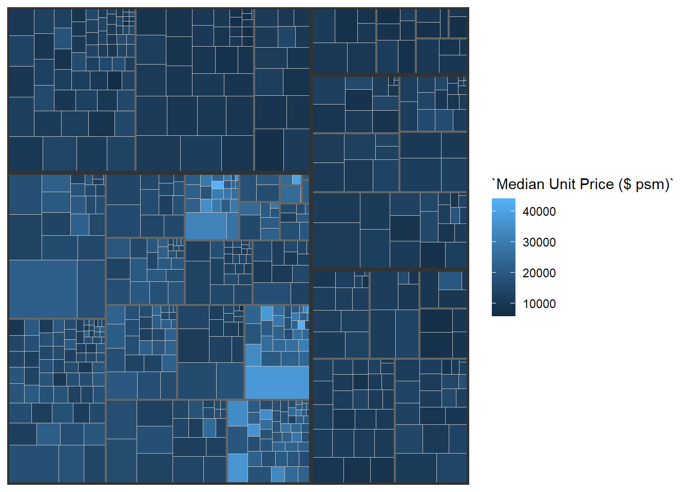
ggtern(data=agpop_mutated,aes(x=YOUNG,y=ACTIVE, z=OLD)) +
geom_point()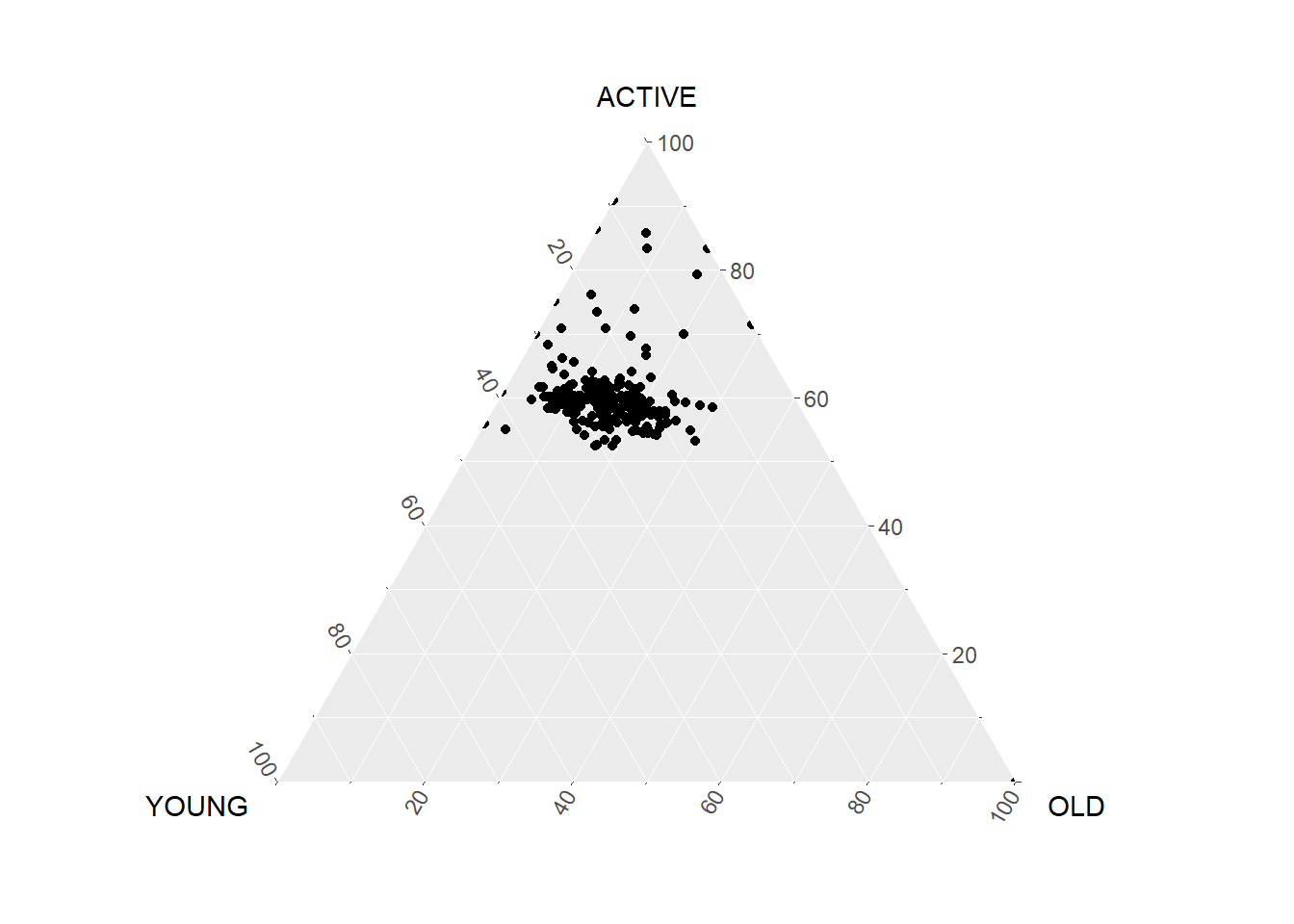
#Building the static ternary plot
ggtern(data=agpop_mutated, aes(x=YOUNG,y=ACTIVE, z=OLD)) + geom_point() + labs(title="Population structure, 2015") + theme_rgbw()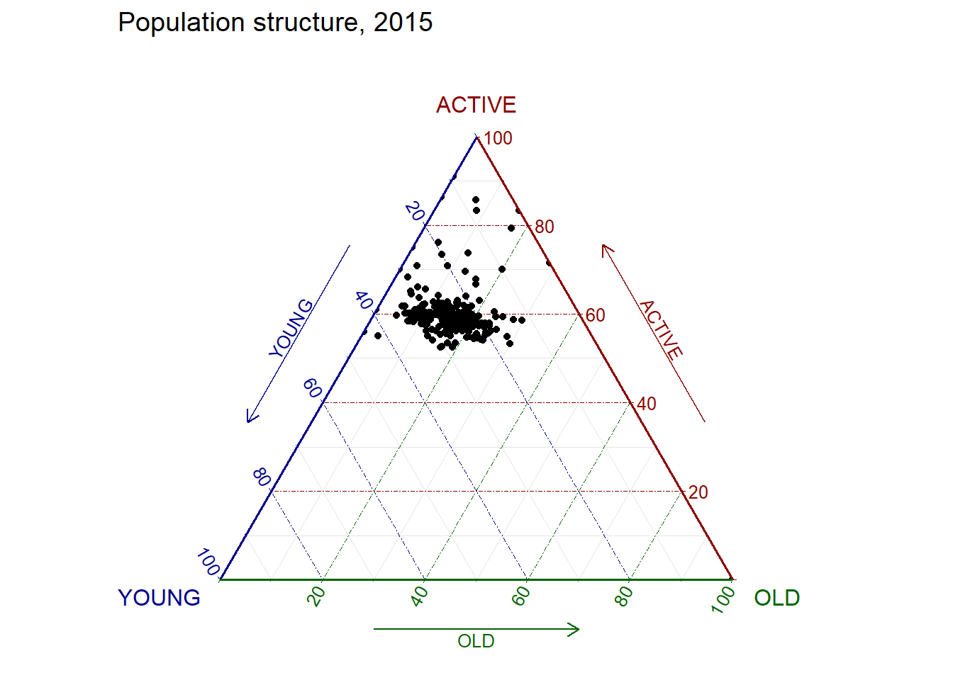
1.4.2 Plotting an interative ternary diagram
The code below create an interactive ternary plot using plot_ly() function of Plotly R.
# reusable function for creating annotation object
label <- function(txt) {
  list(
    text = txt,
    x = 0.1, y = 1,
    ax = 0, ay = 0,
    xref = "paper", yref = "paper",
    align = "center",
    font = list(family = "serif", size = 15, color = "white"),
    bgcolor = "#b3b3b3", bordercolor = "black", borderwidth = 2
  )
}

# reusable function for axis formatting
axis <- function(txt) {
  list(
    title = txt, tickformat = ".0%", tickfont = list(size = 10)
  )
}

ternaryAxes <- list(
  aaxis = axis("Young"),
  baxis = axis("Active"),
  caxis = axis("Old")
)

# Initiating a plotly visualization
plot_ly(
  agpop_mutated,
  a = ~YOUNG,
  b = ~ACTIVE,
  c = ~OLD,
  color = I("black"),
  type = "scatterternary"
) %>%
  layout(
    annotations = label("Ternary Markers"),
    ternary = ternaryAxes
  )
2 Heatmap for Visualising and Analysing Multivariate Data
2.1 Overview
Heatmaps visualise data through variations in colouring. When applied to a tabular format, heatmaps are useful for cross-examining multivariate data, through placing variables in the columns and observation (or records) in rowa and colouring the cells within the table. Heatmaps are good for showing variance across multiple variables, revealing any patterns, displaying whether any variables are similar to each other, and for detecting if any correlations exist in-between them.
In this hands-on exercise, you will gain hands-on experience on using R to plot static and interactive heatmap for visualising and analysing multivariate data.
2.2 Installing and Launching R Packages
Before you get started, you are required to open a new Quarto document. Keep the default html as the authoring format.
Next, you will use the code chunk below to install and launch seriation, heatmaply, dendextend and tidyverse in RStudio.
pacman::p_load(seriation, dendextend, heatmaply, tidyverse)2.3 Importing and Preparing The Data Set
In this hands-on exercise, the data of World Happines 2018 report will be used. The data set is downloaded from here. The original data set is in Microsoft Excel format. It has been extracted and saved in csv file called WHData-2018.csv.
2.3.1 Importing the data set
In the code chunk below, read_csv() of readr is used to import WHData-2018.csv into R and parsed it into tibble R data frame format.
wh <- read_csv("data/WHData-2018.csv")The output tibbled data frame is called wh.
2.3.2 Preparing the data
Next, we need to change the rows by country name instead of row number by using the code chunk below
row.names(wh) <- wh$CountryNotice that the row number has been replaced into the country name.
2.3.3 Transforming the data frame into a matrix
The data was loaded into a data frame, but it has to be a data matrix to make your heatmap.
The code chunk below will be used to transform wh data frame into a data matrix.
wh1 <- dplyr::select(wh, c(3, 7:12))
wh_matrix <- data.matrix(wh)
Notice that wh_matrix is in R matrix format.
2.4 Static Heatmap
There are many R packages and functions can be used to drawing static heatmaps, they are:
heatmap()of R stats package. It draws a simple heatmap.
heatmap.2() of gplots R package. It draws an enhanced heatmap compared to the R base function.
pheatmap() of pheatmap R package. pheatmap package also known as Pretty Heatmap. The package provides functions to draws pretty heatmaps and provides more control to change the appearance of heatmaps.
ComplexHeatmap package of R/Bioconductor package. The package draws, annotates and arranges complex heatmaps (very useful for genomic data analysis). The full reference guide of the package is available here.
superheat package: A Graphical Tool for Exploring Complex Datasets Using Heatmaps. A system for generating extendable and customizable heatmaps for exploring complex datasets, including big data and data with multiple data types. The full reference guide of the package is available here.
In this section, you will learn how to plot static heatmaps by using heatmap() of R Stats package.
2.4.1 heatmap() of R Stats
In this sub-section, we will plot a heatmap by using heatmap() of Base Stats. The code chunk is given below.
wh_heatmap <- heatmap(wh_matrix,
                      Rowv=NA, Colv=NA)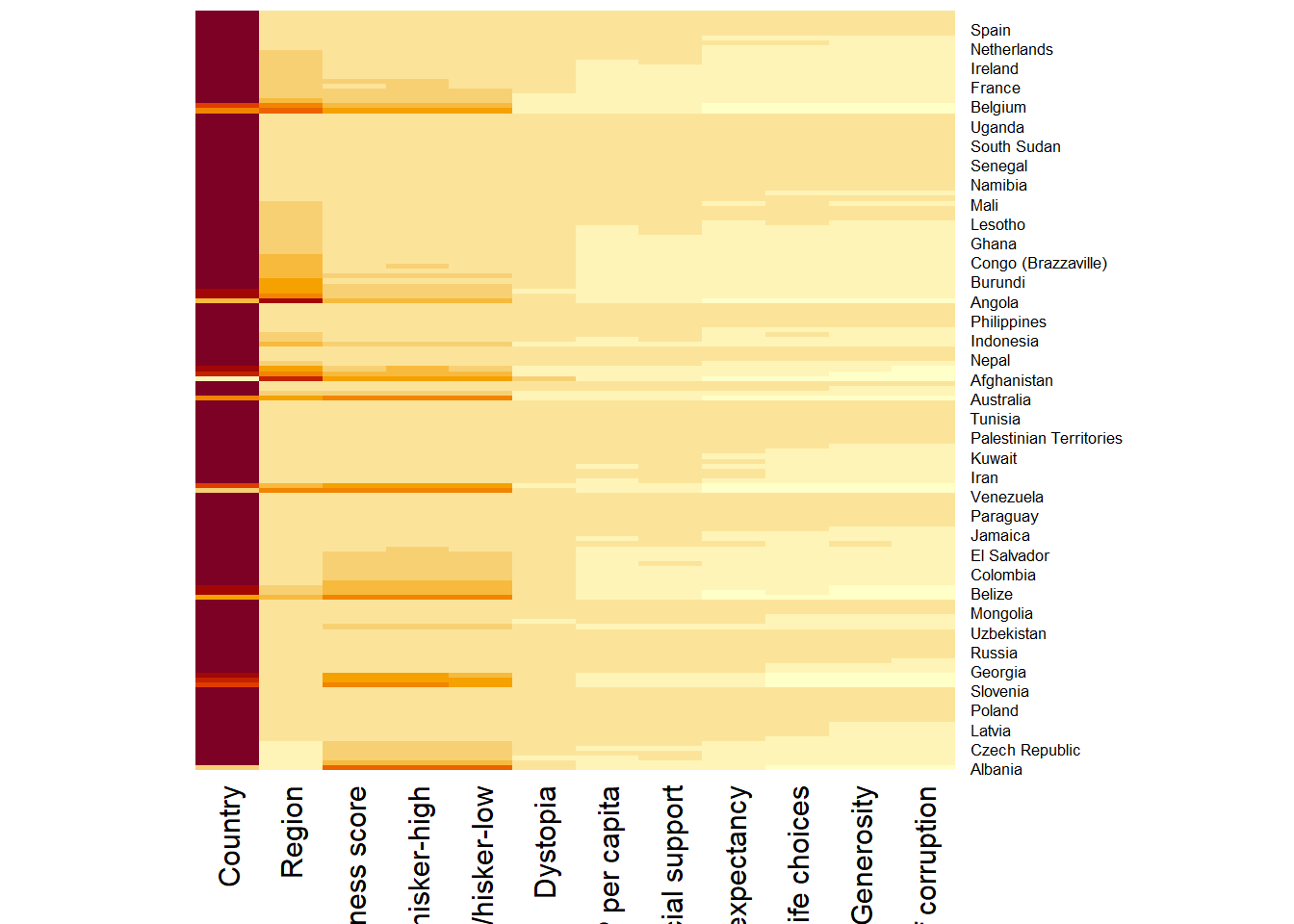
Note:
- By default, heatmap() plots a cluster heatmap. The arguments Rowv=NA and Colv=NA are used to switch off the option of plotting the row and column dendrograms.
To plot a cluster heatmap, we just have to use the default as shown in the code chunk below.
wh_heatmap <- heatmap(wh_matrix)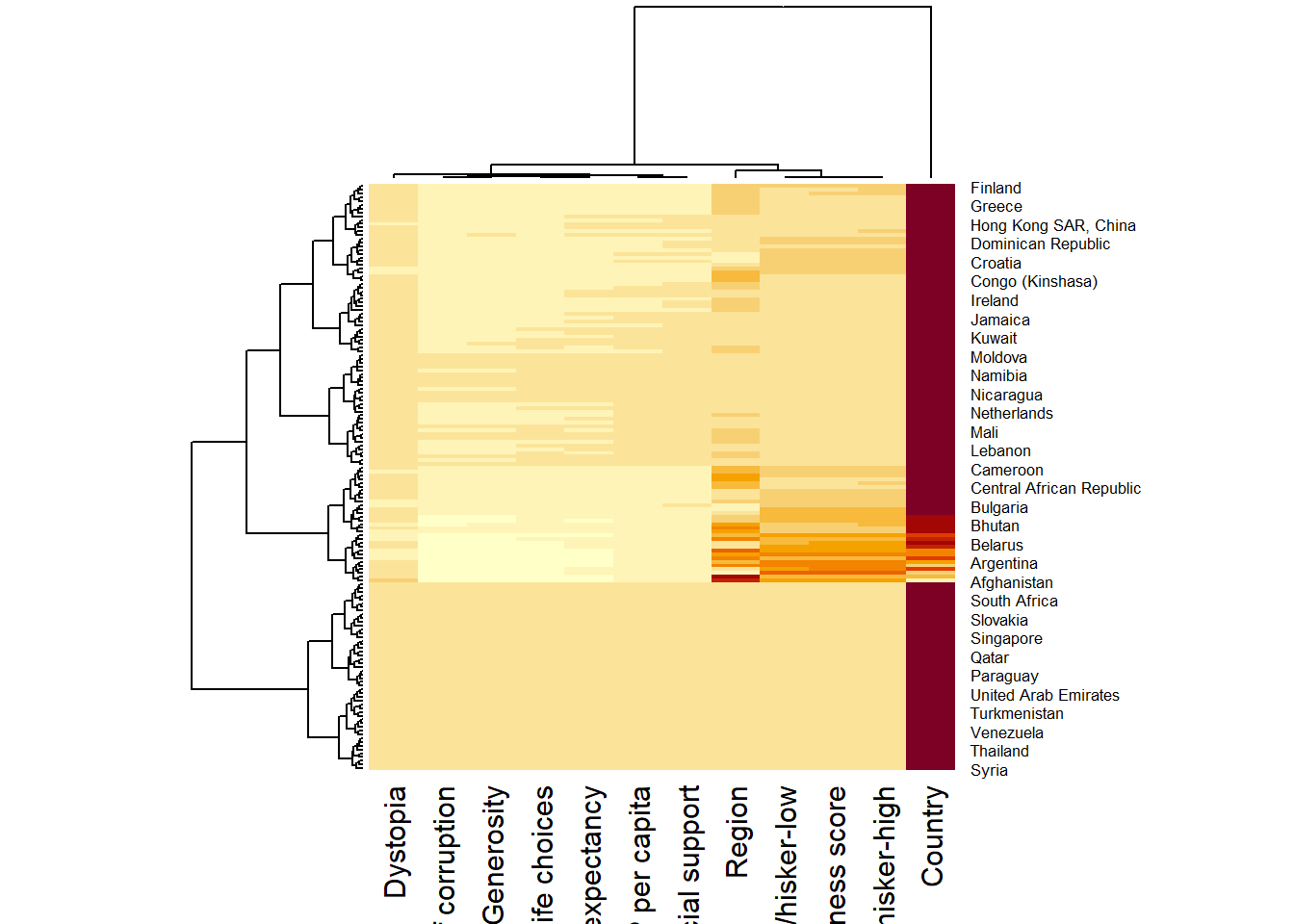
Note:
- The order of both rows and columns is different compare to the native wh_matrix. This is because heatmap do a reordering using clusterisation: it calculates the distance between each pair of rows and columns and try to order them by similarity. Moreover, the corresponding dendrogram are provided beside the heatmap.
Here, red cells denotes small values, and red small ones. This heatmap is not really informative. Indeed, the Happiness Score variable have relatively higher values, what makes that the other variables with small values all look the same. Thus, we need to normalize this matrix. This is done using the scale argument. It can be applied to rows or to columns following your needs.
The code chunk below normalises the matrix column-wise.
wh_heatmap <- heatmap(wh_matrix,
                      scale="column",
                      cexRow = 0.6,
                      cexCol = 0.8,
                      margins = c(10, 4))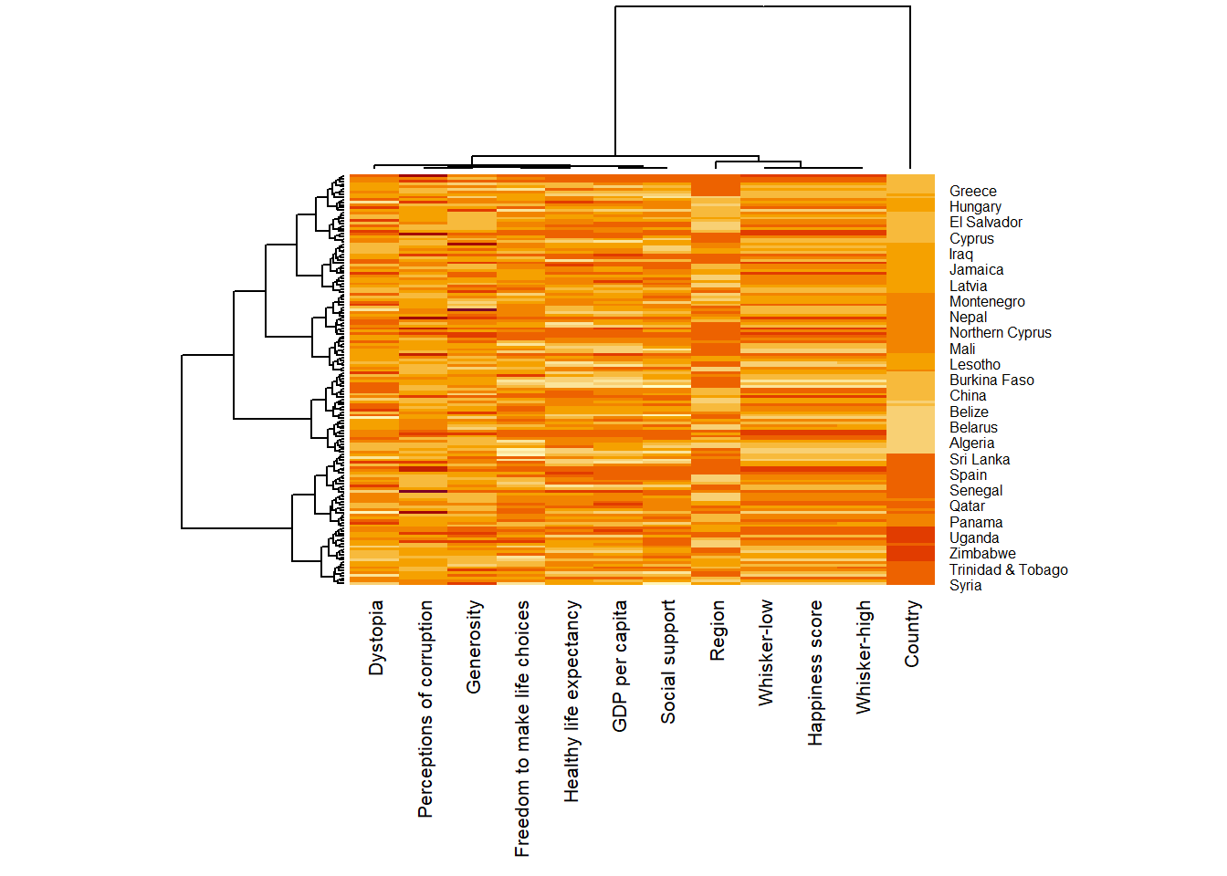
Notice that the values are scaled now. Also note that margins argument is used to ensure that the entire x-axis labels are displayed completely and, cexRow and cexCol arguments are used to define the font size used for y-axis and x-axis labels respectively.
2.5 Creating Interactive Heatmap
heatmaply is an R package for building interactive cluster heatmap that can be shared online as a stand-alone HTML file. It is designed and maintained by Tal Galili.
Before we get started, you should review the Introduction to Heatmaply to have an overall understanding of the features and functions of Heatmaply package. You are also required to have the user manualof the package handy with you for reference purposes.
In this section, you will gain hands-on experience on using heatmaply to design an interactive cluster heatmap. We will still use the wh_matrix as the input data.
2.5.1 Working with heatmaply
heatmaply(mtcars)The code chunk below shows the basic syntax needed to create n interactive heatmap by using heatmaply package.
heatmaply(wh_matrix[, -c(1, 2, 4, 5)])Note that:
Different from heatmap(), for heatmaply() the default horizontal dendrogram is placed on the left hand side of the heatmap.
The text label of each raw, on the other hand, is placed on the right hand side of the heat map.
When the x-axis marker labels are too long, they will be rotated by 135 degree from the north.
2.5.2 Data trasformation
When analysing multivariate data set, it is very common that the variables in the data sets includes values that reflect different types of measurement. In general, these variables’ values have their own range. In order to ensure that all the variables have comparable values, data transformation are commonly used before clustering.
Three main data transformation methods are supported by heatmaply(), namely: scale, normalise and percentilse.
2.5.2.1 Scaling method
When all variables are came from or assumed to come from some normal distribution, then scaling (i.e.: subtract the mean and divide by the standard deviation) would bring them all close to the standard normal distribution.
In such a case, each value would reflect the distance from the mean in units of standard deviation.
The scale argument in heatmaply() supports column and row scaling.
The code chunk below is used to scale variable values columewise.
heatmaply(wh_matrix[, -c(1, 2, 4, 5)],
          scale = "column")
2.5.2.2 Normalising method
When variables in the data comes from possibly different (and non-normal) distributions, the normalize function can be used to bring data to the 0 to 1 scale by subtracting the minimum and dividing by the maximum of all observations.
This preserves the shape of each variable’s distribution while making them easily comparable on the same “scale”.
Different from Scaling, the normalise method is performed on the input data set i.e. wh_matrix as shown in the code chunk below.
heatmaply(normalize(wh_matrix[, -c(1, 2, 4, 5)]))2.5.2.3 Percentising method
This is similar to ranking the variables, but instead of keeping the rank values, divide them by the maximal rank.
This is done by using the ecdf of the variables on their own values, bringing each value to its empirical percentile.
The benefit of the percentize function is that each value has a relatively clear interpretation, it is the percent of observations that got that value or below it.
Similar to Normalize method, the Percentize method is also performed on the input data set i.e. wh_matrix as shown in the code chunk below.
heatmaply(percentize(wh_matrix[, -c(1, 2, 4, 5)]))2.5.3 Clustering algorithm
heatmaply supports a variety of hierarchical clustering algorithm. The main arguments provided are:
distfun: function used to compute the distance (dissimilarity) between both rows and columns. Defaults to dist. The options “pearson”, “spearman” and “kendall” can be used to use correlation-based clustering, which uses as.dist(1 - cor(t(x))) as the distance metric (using the specified correlation method).
hclustfun: function used to compute the hierarchical clustering when Rowv or Colv are not dendrograms. Defaults to hclust.
dist_method default is NULL, which results in “euclidean” to be used. It can accept alternative character strings indicating the method to be passed to distfun. By default distfun is “dist”” hence this can be one of “euclidean”, “maximum”, “manhattan”, “canberra”, “binary” or “minkowski”.
hclust_method default is NULL, which results in “complete” method to be used. It can accept alternative character strings indicating the method to be passed to hclustfun. By default hclustfun is hclust hence this can be one of “ward.D”, “ward.D2”, “single”, “complete”, “average” (= UPGMA), “mcquitty” (= WPGMA), “median” (= WPGMC) or “centroid” (= UPGMC).
In general, a clustering model can be calibrated either manually or statistically.
2.5.4 Manual approach
In the code chunk below, the heatmap is plotted by using hierachical clustering algorithm with “Euclidean distance” and “ward.D” method.
heatmaply(normalize(wh_matrix[, -c(1, 2, 4, 5)]),
          dist_method = "euclidean",
          hclust_method = "ward.D")
2.5.5 Statistical approach
In order to determine the best clustering method and number of cluster the dend_expend() and find_k() functions of dendextend package will be used.
First, the dend_expend() will be used to determine the recommended clustering method to be used.
wh_d <- dist(normalize(wh_matrix[, -c(1, 2, 4, 5)]), method = "euclidean")
dend_expend(wh_d)[[3]]
dist_methods hclust_methods optim
1 unknown ward.D 0.6137851
2 unknown ward.D2 0.6289186
3 unknown single 0.4774362
4 unknown complete 0.6434009
5 unknown average 0.6701688
6 unknown mcquitty 0.5020102
7 unknown median 0.5901833
8 unknown centroid 0.6338734The output table shows that “average” method should be used because it gave the high optimum value.
Next, find_k() is used to determine the optimal number of cluster.
wh_clust <- hclust(wh_d, method = "average")
num_k <- find_k(wh_clust)
plot(num_k)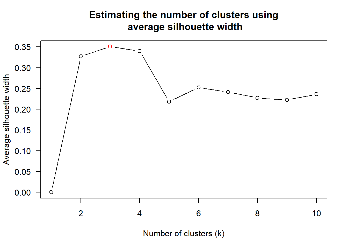
Figure above shows that k=3 would be good.
With reference to the statistical analysis results, we can prepare the code chunk as shown below.
heatmaply(normalize(wh_matrix[, -c(1, 2, 4, 5)]),
          dist_method = "euclidean",
          hclust_method = "average",
          k_row = 3)
2.5.6 Seriation
One of the problems with hierarchical clustering is that it doesn’t actually place the rows in a definite order, it merely constrains the space of possible orderings. Take three items A, B and C. If you ignore reflections, there are three possible orderings: ABC, ACB, BAC. If clustering them gives you ((A+B)+C) as a tree, you know that C can’t end up between A and B, but it doesn’t tell you which way to flip the A+B cluster. It doesn’t tell you if the ABC ordering will lead to a clearer-looking heatmap than the BAC ordering.
heatmaply uses the seriation package to find an optimal ordering of rows and columns. Optimal means to optimize the Hamiltonian path length that is restricted by the dendrogram structure. This, in other words, means to rotate the branches so that the sum of distances between each adjacent leaf (label) will be minimized. This is related to a restricted version of the travelling salesman problem.
Here we meet our first seriation algorithm: Optimal Leaf Ordering (OLO). This algorithm starts with the output of an agglomerative clustering algorithm and produces a unique ordering, one that flips the various branches of the dendrogram around so as to minimize the sum of dissimilarities between adjacent leaves. Here is the result of applying Optimal Leaf Ordering to the same clustering result as the heatmap above.
heatmaply(normalize(wh_matrix[, -c(1, 2, 4, 5)]),
          seriate = "OLO")
The default options is “OLO” (Optimal leaf ordering) which optimizes the above criterion (in O(n^4)). Another option is “GW” (Gruvaeus and Wainer) which aims for the same goal but uses a potentially faster heuristic.
heatmaply(normalize(wh_matrix[, -c(1, 2, 4, 5)]),
          seriate = "GW")
The option “mean” gives the output we would get by default from heatmap functions in other packages such as gplots::heatmap.2.
heatmaply(normalize(wh_matrix[, -c(1, 2, 4, 5)]),
          seriate = "mean")
The option “none” gives us the dendrograms without any rotation that is based on the data matrix.
heatmaply(normalize(wh_matrix[, -c(1, 2, 4, 5)]),
          seriate = "none")
2.5.7 Working with colour palettes
The default colour palette uses by heatmaply is viridis. heatmaply users, however, can use other colour palettes in order to improve the aestheticness and visual friendliness of the heatmap.
In the code chunk below, the Blues colour palette of rColorBrewer is used
heatmaply(normalize(wh_matrix[, -c(1, 2, 4, 5)]),
          seriate = "none",
          colors = Blues)
2.5.8 The finishing touch
Beside providing a wide collection of arguments for meeting the statistical analysis needs, heatmaply also provides many plotting features to ensure cartographic quality heatmap can be produced.
In the code chunk below the following arguments are used:
k_row is used to produce 5 groups.
margins is used to change the top margin to 60 and row margin to 200.
fontsizw_row and fontsize_col are used to change the font size for row and column labels to 4.
main is used to write the main title of the plot.
xlab and ylab are used to write the x-axis and y-axis labels respectively.
heatmaply(normalize(wh_matrix[, -c(1, 2, 4, 5)]),
          Colv=NA,
          seriate = "none",
          colors = Blues,
          k_row = 5,
          margins = c(NA,200,60,NA),
          fontsize_row = 4,
          fontsize_col = 5,
          main="World Happiness Score and Variables by Country, 2018 \nDataTransformation using Normalise Method",
          xlab = "World Happiness Indicators",
          ylab = "World Countries"
          )
3 Visual Multivariate Analysis with Parallel Coordinates Plot
3.1 Overview
Parallel coordinates plot is a data visualisation specially designed for visualising and analysing multivariate, numerical data. It is ideal for comparing multiple variables together and seeing the relationships between them. For example, the variables contribute to Happiness Index. Parallel coordinates was invented by Alfred Inselberg in the 1970s as a way to visualize high-dimensional data. This data visualisation technique is more often found in academic and scientific communities than in business and consumer data visualizations. As pointed out by Stephen Few(2006), “This certainly isn’t a chart that you would present to the board of directors or place on your Web site for the general public. In fact, the strength of parallel coordinates isn’t in their ability to communicate some truth in the data to others, but rather in their ability to bring meaningful multivariate patterns and comparisons to light when used interactively for analysis.” For example, parallel coordinates plot can be used to characterise clusters detected during customer segmentation.
By the end of this hands-on exercise, you will gain hands-on experience on:
plotting statistic parallel coordinates plots by using ggparcoord() of GGally package,
plotting interactive parallel coordinates plots by using parcoords package, and
plotting interactive parallel coordinates plots by using parallelPlot package.
3.2 Installing and Launching R Packages
For this exercise, the GGally, parcoords, parallelPlot and tidyverse packages will be used.
The code chunks below are used to install and load the packages in R.
pacman::p_load(GGally, parallelPlot, tidyverse)3.3 Data Preparation
In this hands-on exercise, the World Happinees 2018 (http://worldhappiness.report/ed/2018/) data will be used. The data set is download at https://s3.amazonaws.com/happiness-report/2018/WHR2018Chapter2OnlineData.xls. The original data set is in Microsoft Excel format. It has been extracted and saved in csv file called WHData-2018.csv.
In the code chunk below, read_csv() of readr package is used to import WHData-2018.csv into R and save it into a tibble data frame object called wh.
wh <- read_csv("data/WHData-2018.csv")3.4 Plotting Static Parallel Coordinates Plot
In this section, you will learn how to plot static parallel coordinates plot by using ggparcoord() of GGally package. Before getting started, it is a good practice to read the function description in detail.
3.4.1 Plotting a simple parallel coordinates
Code chunk below shows a typical syntax used to plot a basic static parallel coordinates plot by using ggparcoord().
ggparcoord(data = wh,
           columns = c(7:12))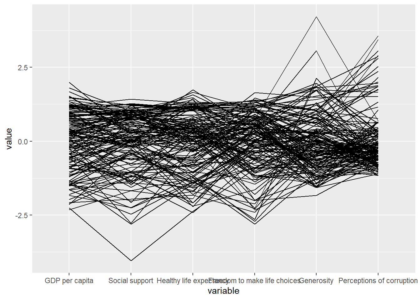
Notice that only two argument namely data and columns is used. Data argument is used to map the data object (i.e. wh) and columns is used to select the columns for preparing the parallel coordinates plot.
3.4.2 Plotting a parallel coordinates with boxplot
The basic parallel coordinates failed to reveal any meaning understanding of the World Happiness measures. In this section, you will learn how to makeover the plot by using a collection of arguments provided by ggparcoord().
ggparcoord(data = wh,
           columns = c(7:12),
           groupColumn = 2,
           scale = "uniminmax",
           alphaLines = 0.2,
           boxplot = TRUE,
           title = "Parallel Coordinates Plot of World Happines Variables")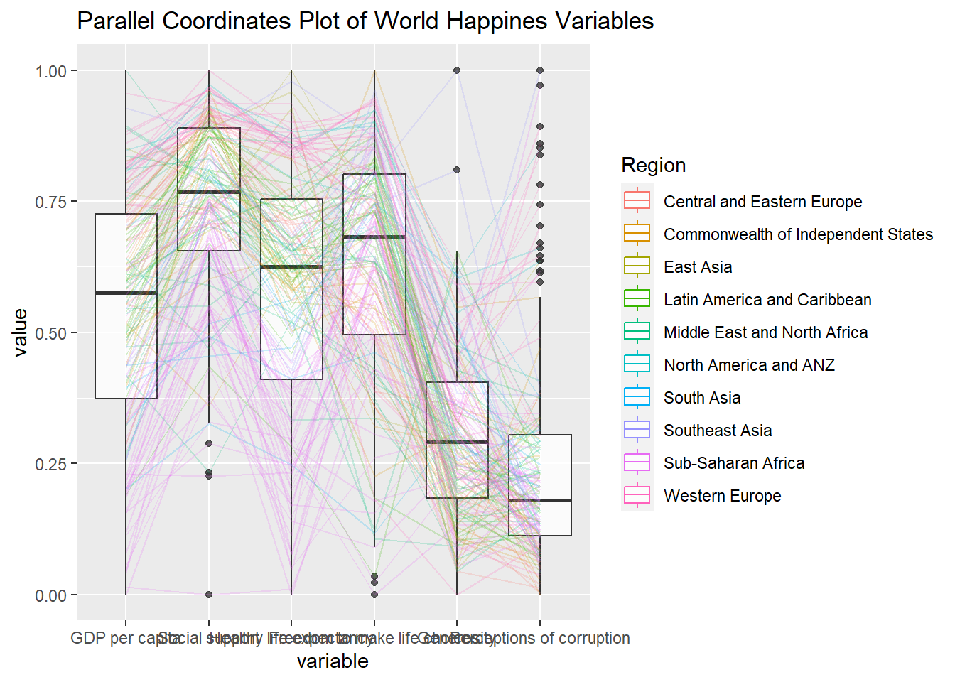
Things to learn from the code chunk above.
groupColumnargument is used to group the observations (i.e. parallel lines) by using a single variable (i.e. Region) and colour the parallel coordinates lines by region name.scaleargument is used to scale the variables in the parallel coordinate plot by usinguniminmaxmethod. The method univariately scale each variable so the minimum of the variable is zero and the maximum is one.alphaLinesargument is used to reduce the intensity of the line colour to 0.2. The permissible value range is between 0 to 1.boxplotargument is used to turn on the boxplot by using logicalTRUE. The default isFALSE.titleargument is used to provide the parallel coordinates plot a title.
3.4.3 Parallel coordinates with facet
Since ggparcoord() is developed by extending ggplot2 package, we can combination use some of the ggplot2 function when plotting a parallel coordinates plot.
In the code chunk below, facet_wrap() of ggplot2 is used to plot 10 small multiple parallel coordinates plots. Each plot represent one geographical region such as East Asia.
ggparcoord(data = wh,
           columns = c(7:12),
           groupColumn = 2,
           scale = "uniminmax",
           alphaLines = 0.2,
           boxplot = TRUE,
           title = "Multiple Parallel Coordinates Plots of World Happines Variables by Region") +
  facet_wrap(~ Region)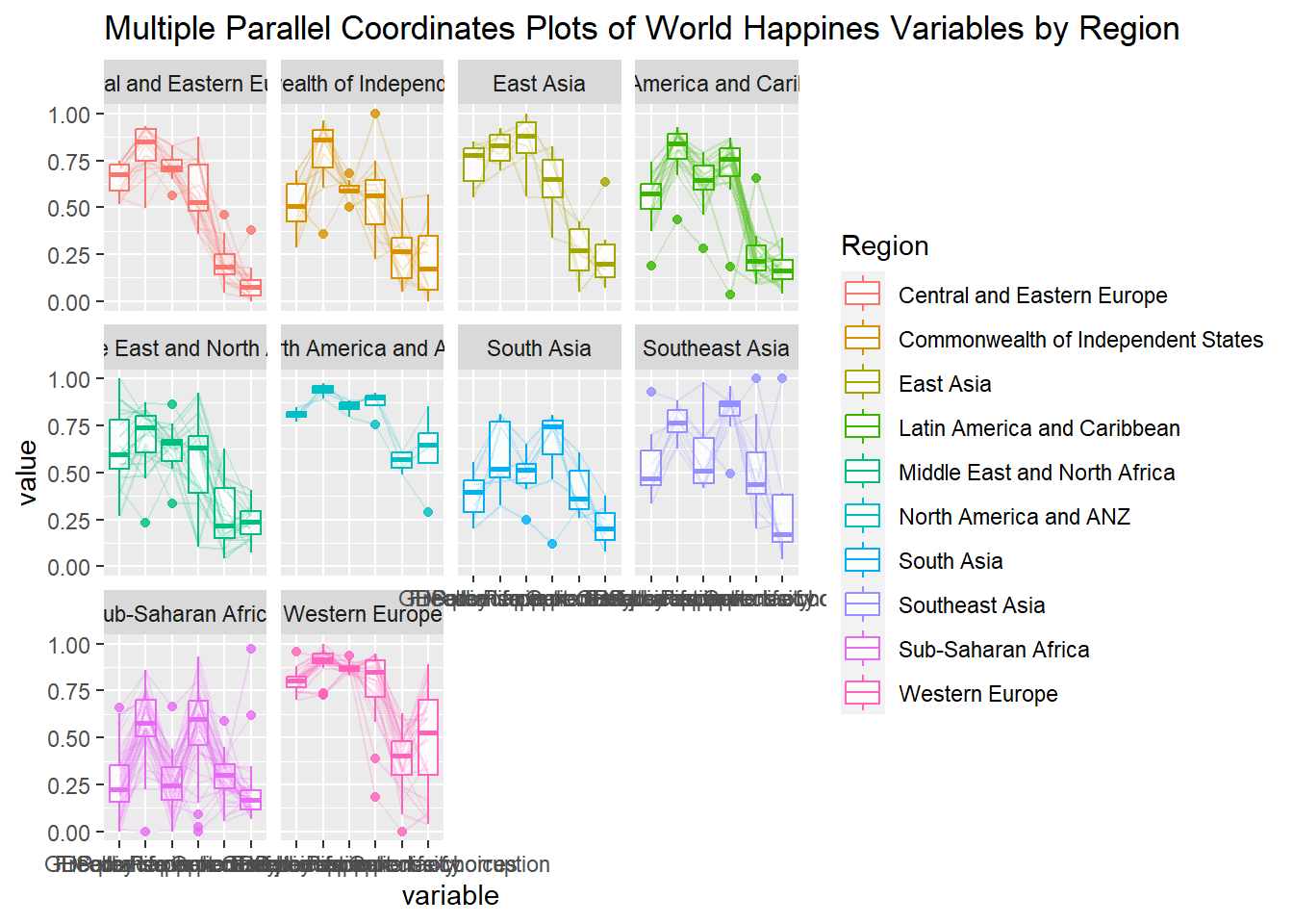
One of the aesthetic defect of the current design is that some of the variable names overlap on x-axis.
3.4.4 Rotating x-axis text label
To make the x-axis text label easy to read, let us rotate the labels by 30 degrees. We can rotate axis text labels using theme() function in ggplot2 as shown in the code chunk below
ggparcoord(data = wh,
           columns = c(7:12),
           groupColumn = 2,
           scale = "uniminmax",
           alphaLines = 0.2,
           boxplot = TRUE,
           title = "Multiple Parallel Coordinates Plots of World Happines Variables by Region") +
  facet_wrap(~ Region) +
  theme(axis.text.x = element_text(angle = 30))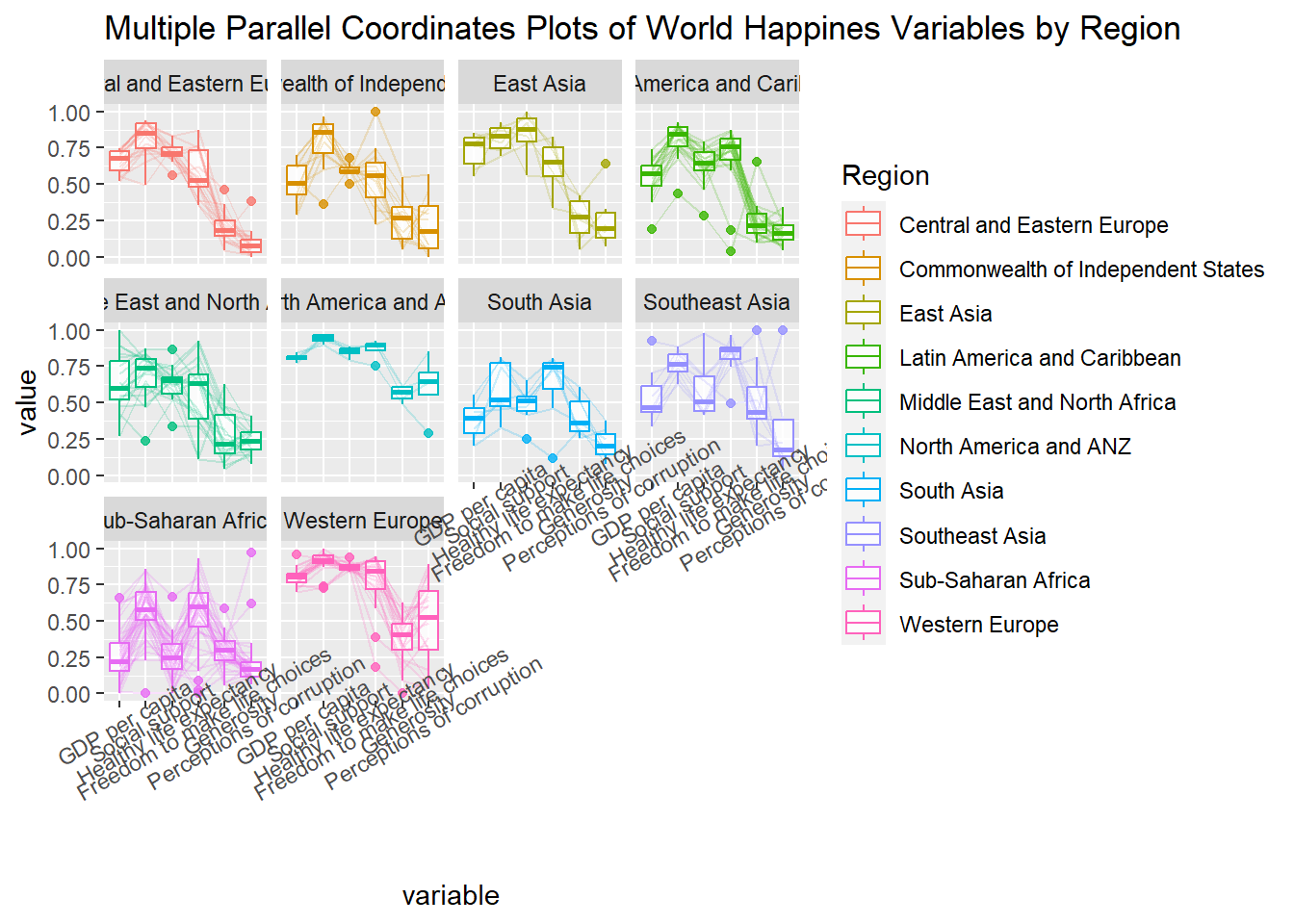
Thing to learn from the code chunk above:
- To rotate x-axis text labels, we use
axis.text.xas argument totheme()function. And we specifyelement_text(angle = 30)to rotate the x-axis text by an angle 30 degree.
3.4.5 Adjusting the rotated x-axis text label
Rotating x-axis text labels to 30 degrees makes the label overlap with the plot and we can avoid this by adjusting the text location using hjust argument to theme’s text element with element_text(). We use axis.text.x as we want to change the look of x-axis text.
ggparcoord(data = wh,
           columns = c(7:12),
           groupColumn = 2,
           scale = "uniminmax",
           alphaLines = 0.2,
           boxplot = TRUE,
           title = "Multiple Parallel Coordinates Plots of World Happines Variables by Region") +
  facet_wrap(~ Region) +
  theme(axis.text.x = element_text(angle = 30, hjust=1))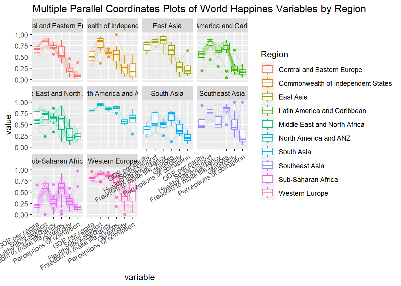
3.5 Plotting Interactive Parallel Coordinates Plot: parallelPlot methods
parallelPlot is an R package specially designed to plot a parallel coordinates plot by using ‘htmlwidgets’ package and d3.js. In this section, you will learn how to use functions provided in parallelPlot package to build interactive parallel coordinates plot.
3.5.1 The basic plot
The code chunk below plot an interactive parallel coordinates plot by using parallelPlot().
wh <- wh %>%
  select("Happiness score", c(7:12))
parallelPlot(wh,
             width = 320,
             height = 250)
Notice that some of the axis labels are too long. You will learn how to overcome this problem in the next step.
3.5.2 Rotate axis label
In the code chunk below, rotateTitle argument is used to avoid overlapping axis labels.
parallelPlot(wh,
             rotateTitle = TRUE)
One of the useful interactive feature of parallelPlot is we can click on a variable of interest, for example Happiness score, the monotonous blue colour (default) will change a blues with different intensity colour scheme will be used.
3.5.3 Changing the colour scheme
We can change the default blue colour scheme by using continousCS argument as shown in the code chunl below.
parallelPlot(wh,
             continuousCS = "YlOrRd",
             rotateTitle = TRUE)
3.5.4 Parallel coordinates plot with histogram
In the code chunk below, histoVisibility argument is used to plot histogram along the axis of each variables.
histoVisibility <- rep(TRUE, ncol(wh))
parallelPlot(wh,
             rotateTitle = TRUE,
             histoVisibility = histoVisibility)
3.6 References
ggparcoord() of GGally package
4 Treemap Visualisation with R
4.1 Overview
In this hands-on exercise, you will gain hands-on experiences on designing treemap using appropriate R packages. The hands-on exercise consists of three main section. First, you will learn how to manipulate transaction data into a treemap strcuture by using selected functions provided in dplyr package. Then, you will learn how to plot static treemap by using treemap package. In the third section, you will learn how to design interactive treemap by using d3treeR package.
4.2 Installing and Launching R Packages
Before we get started, you are required to check if treemap and tidyverse pacakges have been installed in you R.
pacman::p_load(treemap, treemapify, tidyverse) 4.3 Data Wrangling
In this exercise, REALIS2018.csv data will be used. This dataset provides information of private property transaction records in 2018. The dataset is extracted from REALIS portal (https://spring.ura.gov.sg/lad/ore/login/index.cfm) of Urban Redevelopment Authority (URA).
4.3.1 Importing the data set
In the code chunk below, read_csv() of readr is used to import realis2018.csv into R and parsed it into tibble R data.frame format.
realis2018 <- read_csv("data/realis2018.csv")The output tibble data.frame is called realis2018.
4.3.2 Data Wrangling and Manipulation
The data.frame realis2018 is in trasaction record form, which is highly disaggregated and not appropriate to be used to plot a treemap. In this section, we will perform the following steps to manipulate and prepare a data.frtame that is appropriate for treemap visualisation:
group transaction records by Project Name, Planning Region, Planning Area, Property Type and Type of Sale, and
compute Total Unit Sold, Total Area, Median Unit Price and Median Transacted Price by applying appropriate summary statistics on No. of Units, Area (sqm), Unit Price ($ psm) and Transacted Price ($) respectively.
Two key verbs of dplyr package, namely: group_by() and summarize() will be used to perform these steps.
group_by() breaks down a data.frame into specified groups of rows. When you then apply the verbs above on the resulting object they’ll be automatically applied “by group”.
Grouping affects the verbs as follows:
grouped select() is the same as ungrouped select(), except that grouping variables are always retained.
grouped arrange() is the same as ungrouped; unless you set .by_group = TRUE, in which case it orders first by the grouping variables.
mutate() and filter() are most useful in conjunction with window functions (like rank(), or min(x) == x). They are described in detail in vignette(“window-functions”).
sample_n() and sample_frac() sample the specified number/fraction of rows in each group.
summarise() computes the summary for each group.
In our case, group_by() will used together with summarise() to derive the summarised data.frame.
Note
Recommendation
- Students who are new to dplyr methods should consult Introduction to dplyr before moving on to the next section.
4.3.3 Grouped summaries without the Pipe
The code chank below shows a typical two lines code approach to perform the steps.
realis2018_grouped <- group_by(realis2018, `Project Name`,
                               `Planning Region`, `Planning Area`,
                               `Property Type`, `Type of Sale`)
realis2018_summarised <- summarise(realis2018_grouped,
                          `Total Unit Sold` = sum(`No. of Units`, na.rm = TRUE),
                          `Total Area` = sum(`Area (sqm)`, na.rm = TRUE),
                          `Median Unit Price ($ psm)` = median(`Unit Price ($ psm)`, na.rm = TRUE),
                          `Median Transacted Price` = median(`Transacted Price ($)`, na.rm = TRUE))
Important
Note
- Aggregation functions such as sum() and meadian() obey the usual rule of missing values: if there’s any missing value in the input, the output will be a missing value. The argument na.rm = TRUE removes the missing values prior to computation.
The code chunk above is not very efficient because we have to give each intermediate data.frame a name, even though we don’t have to care about it.
4.3.4 Grouped summaries with the pipe
The code chunk below shows a more efficient way to tackle the same processes by using the pipe, %>%:
Note
Recommendation
To learn more about pipe, visit this excellent article: Pipes in R Tutorial For Beginners.
realis2018_summarised <- realis2018 %>%
  group_by(`Project Name`,`Planning Region`,
           `Planning Area`, `Property Type`,
           `Type of Sale`) %>%
  summarise(`Total Unit Sold` = sum(`No. of Units`, na.rm = TRUE),
            `Total Area` = sum(`Area (sqm)`, na.rm = TRUE),
            `Median Unit Price ($ psm)` = median(`Unit Price ($ psm)`, na.rm = TRUE),
            `Median Transacted Price` = median(`Transacted Price ($)`, na.rm = TRUE))
4.4 Designing Treemap with treemap Package
treemap package is a R package specially designed to offer great flexibility in drawing treemaps. The core function, namely: treemap() offers at least 43 arguments. In this section, we will only explore the major arguments for designing elegent and yet truthful treemaps.
4.4.1 Designing a static treemap
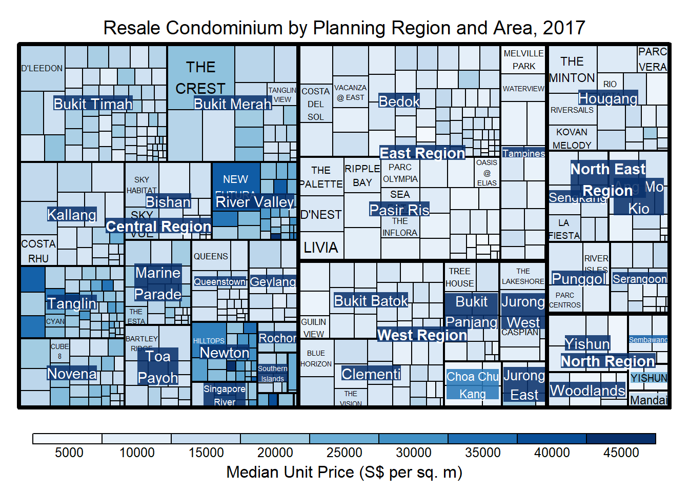
In this section, treemap() of Treemap package is used to plot a treemap showing the distribution of median unit prices and total unit sold of resale condominium by geographic hierarchy in 2017.
First, we will select records belongs to resale condominium property type from realis2018_selected data frame.
realis2018_selected <- realis2018_summarised %>%
  filter(`Property Type` == "Condominium", `Type of Sale` == "Resale")
4.4.2 Using the basic arguments
The code chunk below designed a treemap by using three core arguments of treemap(), namely: index, vSize and vColor.
treemap(realis2018_selected,
        index=c("Planning Region", "Planning Area", "Project Name"),
        vSize="Total Unit Sold",
        vColor="Median Unit Price ($ psm)",
        title="Resale Condominium by Planning Region and Area, 2017",
        title.legend = "Median Unit Price (S$ per sq. m)"
        )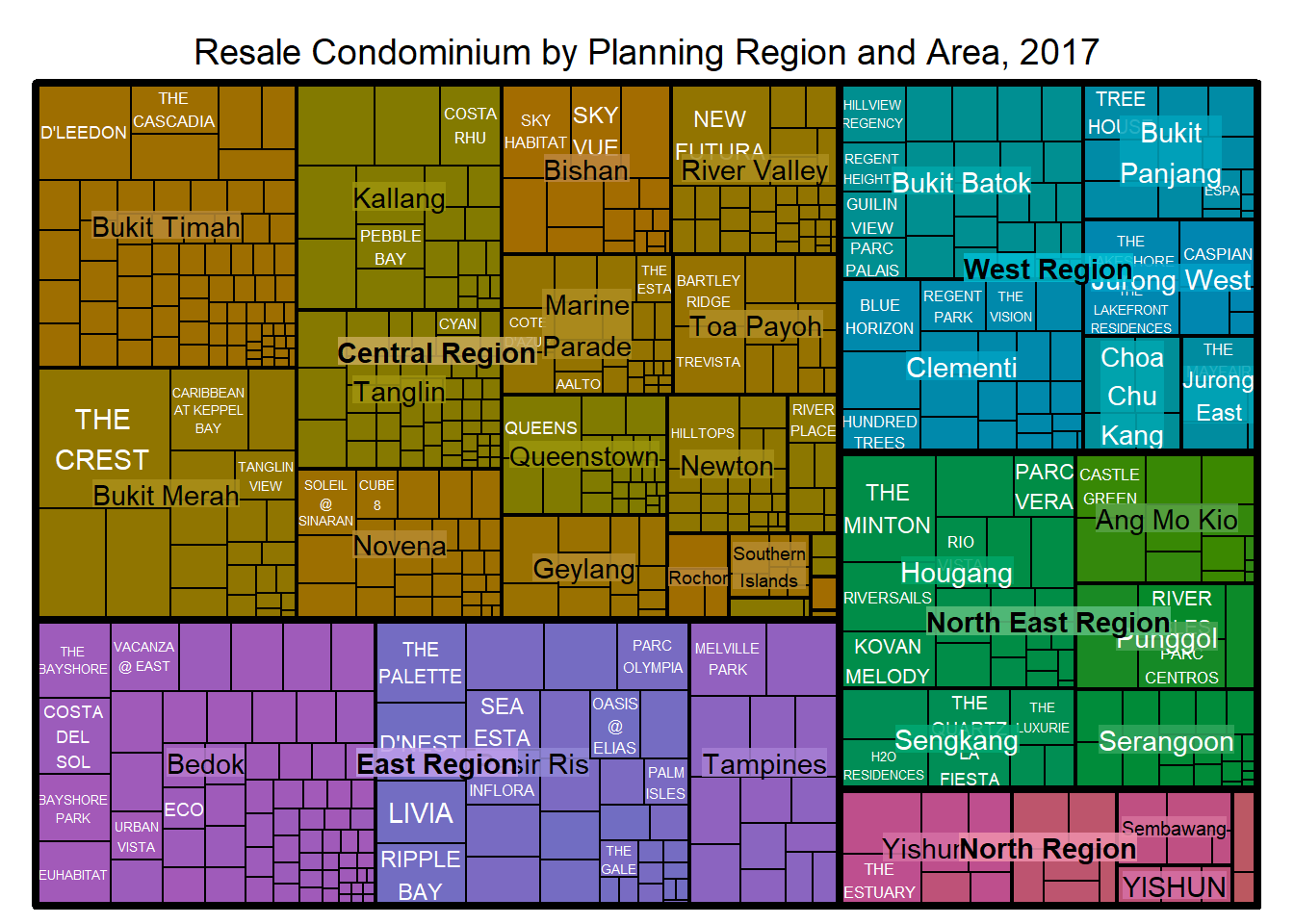
Things to learn from the three arguments used:
index
The index vector must consist of at least two column names or else no hierarchy treemap will be plotted.
If multiple column names are provided, such as the code chunk above, the first name is the highest aggregation level, the second name the second highest aggregation level, and so on.
vSize
- The column must not contain negative values. This is because it’s vaues will be used to map the sizes of the rectangles of the treemaps.
Warning:
The treemap above was wrongly coloured. For a correctly designed treemap, the colours of the rectagles should be in different intensity showing, in our case, median unit prices.
For treemap(), vColor is used in combination with the argument type to determines the colours of the rectangles. Without defining type, like the code chunk above, treemap() assumes type = index, in our case, the hierarchy of planning areas.
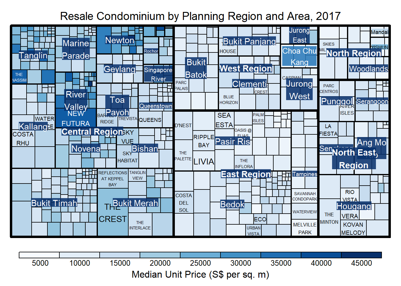
4.4.3 Working with vColor and type arguments
In the code chunk below, type argument is define as value.
treemap(realis2018_selected,
        index=c("Planning Region", "Planning Area", "Project Name"),
        vSize="Total Unit Sold",
        vColor="Median Unit Price ($ psm)",
        type = "value",
        title="Resale Condominium by Planning Region and Area, 2017",
        title.legend = "Median Unit Price (S$ per sq. m)"
        )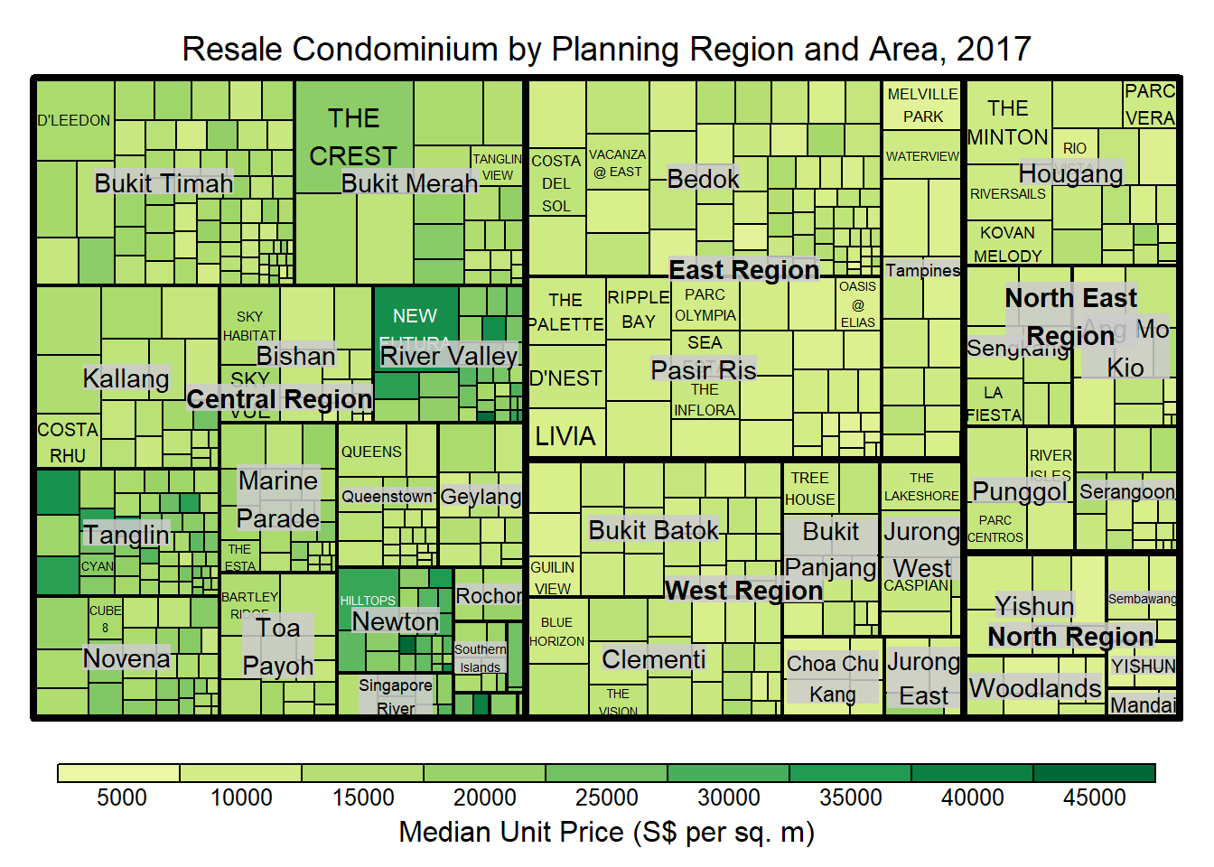
Thinking to learn from the conde chunk above.
The rectangles are coloured with different intensity of green, reflecting their respective median unit prices.
The legend reveals that the values are binned into ten bins, i.e. 0-5000, 5000-10000, etc. with an equal interval of 5000.
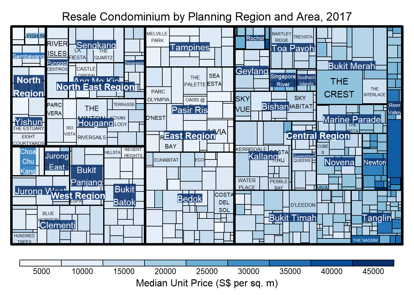
4.4.4 Colours in treemap package
There are two arguments that determine the mapping to color palettes: mapping and palette. The only difference between “value” and “manual” is the default value for mapping. The “value” treemap considers palette to be a diverging color palette (say ColorBrewer’s “RdYlBu”), and maps it in such a way that 0 corresponds to the middle color (typically white or yellow), -max(abs(values)) to the left-end color, and max(abs(values)), to the right-end color. The “manual” treemap simply maps min(values) to the left-end color, max(values) to the right-end color, and mean(range(values)) to the middle color.
4.4.5 The “value” type treemap
The code chunk below shows a value type treemap.
treemap(realis2018_selected,
        index=c("Planning Region", "Planning Area", "Project Name"),
        vSize="Total Unit Sold",
        vColor="Median Unit Price ($ psm)",
        type="value",
        palette="RdYlBu",
        title="Resale Condominium by Planning Region and Area, 2017",
        title.legend = "Median Unit Price (S$ per sq. m)"
        )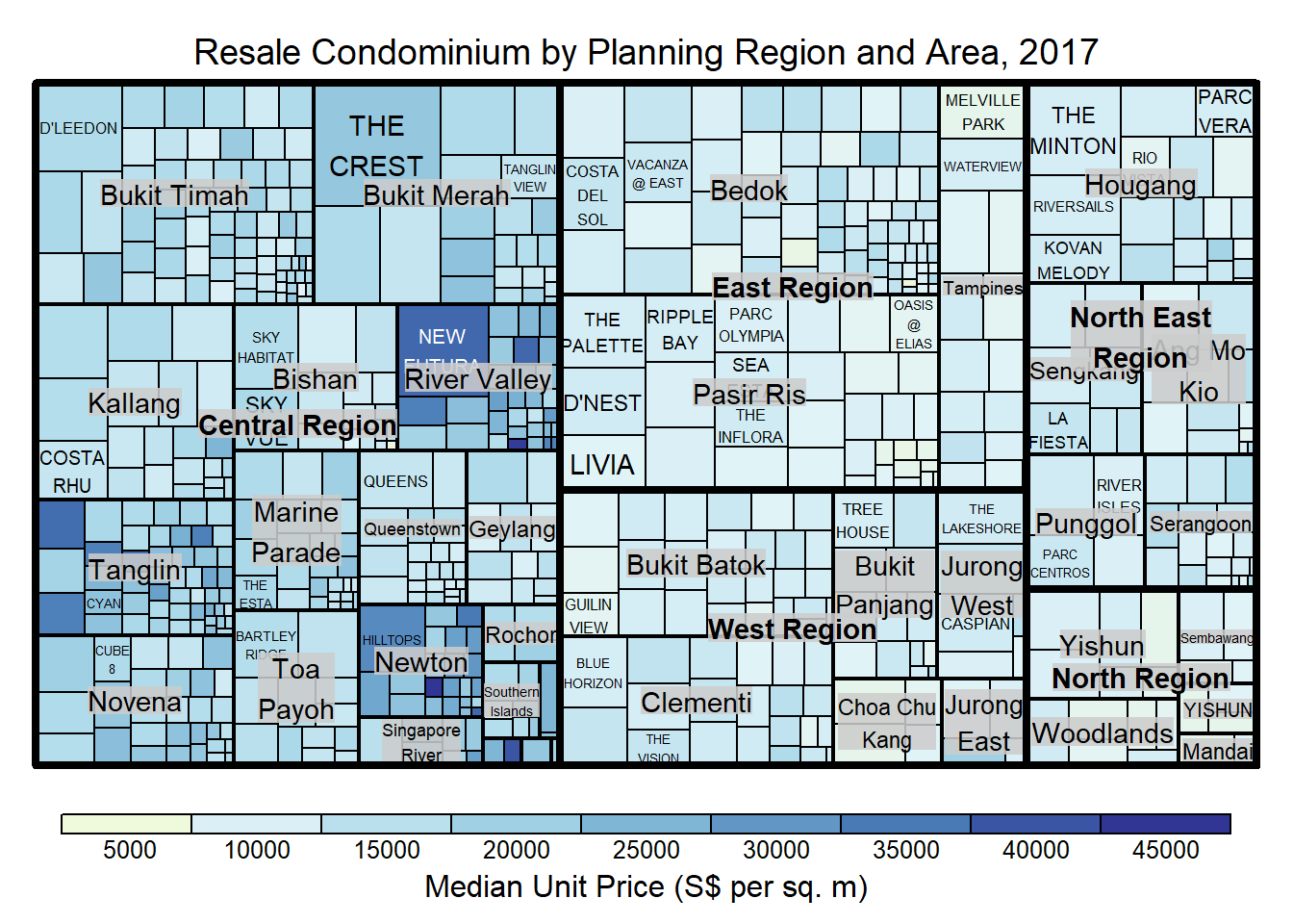
Thing to learn from the code chunk above:
although the colour palette used is RdYlBu but there are no red rectangles in the treemap above. This is because all the median unit prices are positive.
The reason why we see only 5000 to 45000 in the legend is because the range argument is by default c(min(values, max(values)) with some pretty rounding.
4.4.6 The “manual” type treemap
The “manual” type does not interpret the values as the “value” type does. Instead, the value range is mapped linearly to the colour palette.
The code chunk below shows a manual type treemap.
treemap(realis2018_selected,
        index=c("Planning Region", "Planning Area", "Project Name"),
        vSize="Total Unit Sold",
        vColor="Median Unit Price ($ psm)",
        type="manual",
        palette="RdYlBu",
        title="Resale Condominium by Planning Region and Area, 2017",
        title.legend = "Median Unit Price (S$ per sq. m)"
        )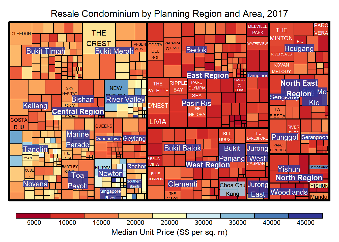
Things to learn from the code chunk above:
- The colour scheme used is very copnfusing. This is because mapping = (min(values), mean(range(values)), max(values)). It is not wise to use diverging colour palette such as RdYlBu if the values are all positive or negative
To overcome this problem, a single colour palette such as Blues should be used.
treemap(realis2018_selected,
        index=c("Planning Region", "Planning Area", "Project Name"),
        vSize="Total Unit Sold",
        vColor="Median Unit Price ($ psm)",
        type="manual",
        palette="Blues",
        title="Resale Condominium by Planning Region and Area, 2017",
        title.legend = "Median Unit Price (S$ per sq. m)"
        )
4.4.7 Treemap Layout
treemap() supports two popular treemap layouts, namely: “squarified” and “pivotSize”. The default is “pivotSize”.
The squarified treemap algorithm (Bruls et al., 2000) produces good aspect ratios, but ignores the sorting order of the rectangles (sortID). The ordered treemap, pivot-by-size, algorithm (Bederson et al., 2002) takes the sorting order (sortID) into account while aspect ratios are still acceptable.
4.4.8 Working with algorithm argument
The code chunk below plots a squarified treemap by changing the algorithm argument.
treemap(realis2018_selected,
        index=c("Planning Region", "Planning Area", "Project Name"),
        vSize="Total Unit Sold",
        vColor="Median Unit Price ($ psm)",
        type="manual",
        palette="Blues",
        algorithm = "squarified",
        title="Resale Condominium by Planning Region and Area, 2017",
        title.legend = "Median Unit Price (S$ per sq. m)"
        )
4.4.9 Using sortID
When “pivotSize” algorithm is used, sortID argument can be used to dertemine the order in which the rectangles are placed from top left to bottom right.
treemap(realis2018_selected,
        index=c("Planning Region", "Planning Area", "Project Name"),
        vSize="Total Unit Sold",
        vColor="Median Unit Price ($ psm)",
        type="manual",
        palette="Blues",
        algorithm = "pivotSize",
        sortID = "Median Transacted Price",
        title="Resale Condominium by Planning Region and Area, 2017",
        title.legend = "Median Unit Price (S$ per sq. m)"
        )
4.5 Designing Treemap using treemapify Package
treemapify is a R package specially developed to draw treemaps in ggplot2. In this section, you will learn how to designing treemps closely resemble treemaps designing in previous section by using treemapify. Before you getting started, you should read Introduction to “treemapify” its user guide.
4.5.1 Designing a basic treemap
ggplot(data=realis2018_selected,
       aes(area = `Total Unit Sold`,
           fill = `Median Unit Price ($ psm)`),
       layout = "scol",
       start = "bottomleft") +
  geom_treemap() +
  scale_fill_gradient(low = "light blue", high = "blue")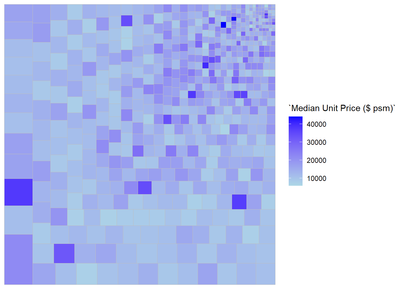
4.5.2 Defining hierarchy
Group by Planning Region
ggplot(data=realis2018_selected,
       aes(area = `Total Unit Sold`,
           fill = `Median Unit Price ($ psm)`,
           subgroup = `Planning Region`),
       start = "topleft") +
  geom_treemap()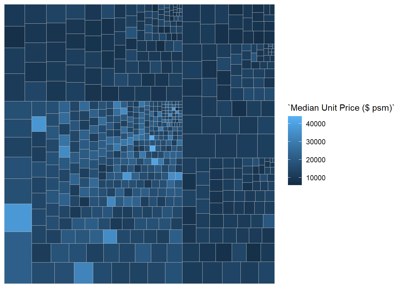
Group by Planning Area
ggplot(data=realis2018_selected,
       aes(area = `Total Unit Sold`,
           fill = `Median Unit Price ($ psm)`,
           subgroup = `Planning Region`,
           subgroup2 = `Planning Area`)) +
  geom_treemap()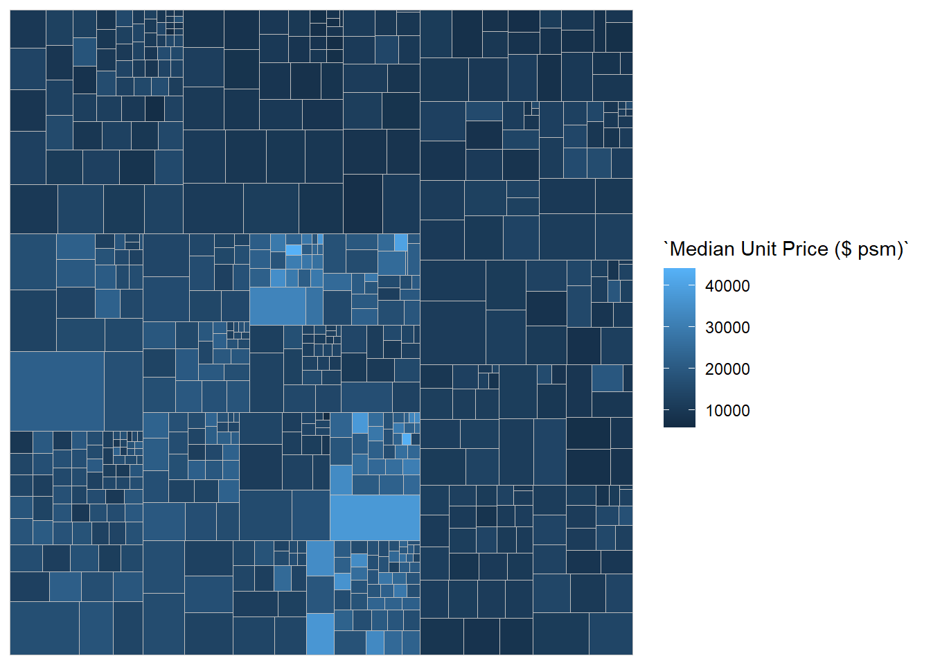
Adding boundary line
ggplot(data=realis2018_selected,
       aes(area = `Total Unit Sold`,
           fill = `Median Unit Price ($ psm)`,
           subgroup = `Planning Region`,
           subgroup2 = `Planning Area`)) +
  geom_treemap() +
  geom_treemap_subgroup2_border(colour = "gray40",
                                size = 2) +
  geom_treemap_subgroup_border(colour = "gray20")