pacman::p_load(ggrepel, patchwork,
               ggthemes, hrbrthemes,
tidyverse, haven, ggplot2, dplyr,ggstatsplot,tidyr) Take Home Exercise 2: DataVis Makeover
For this Data Visualization Makeover exercise, i have choose my classmates Xu Lin’s work of his take home exercise 1, and i will try to make improvements on his work so that it can be an better visual analysis.
1. Overview:
Objective
For this exercise the objective is to look at the distribution of Singapore students’ performance in mathematics, reading, and science, and the relationship between these subjects performances with schools, gender and socioeconomic status of the students.
Methods
For this Analysis, the average score of mathematics, reading, and science is used as benchmark to do the analysis and visualization. and also for schools, gender and socioeconomic status variables.
Limitations
The mean serves as merely one benchmark and might not be universally applicable due to its sensitivity to extreme values, which can skew the representation of a data set’s central tendency. Moreover, our choice of data is informed by subjective interpretation, potentially leading to biased datasets because it reflects our preconceptions and possible exclusion of relevant data points.
2 Import R package & Data
Install R package
Installing necessary R packages that will be needed for this exercise. To load the requried packages the code chunk below use pacman::p_load() function is used to unsure that the packages are load to the current R work environment.
Import Data
For this exercise, we are only examining the Singapore students. So the data load in the below code chunk only contains
stu_qqq_SG <- readRDS("C:/lzc0313/ISSS608-VAA/In-class_Ex/In-class_ex1/data/stu_qqq_SG.rds")Prepare Data
After examing the data, found that the subject scores are named as PV1MATH to PV10MATCH and also same for other two subjects. The below code chunks calculates the average of PV1 to PV10 for all three subject.
stu_qqq_SG_MRS <- stu_qqq_SG %>%
  mutate(AVEMATH = (PV1MATH + PV2MATH + PV3MATH + PV4MATH + PV5MATH + PV6MATH + PV7MATH + PV8MATH + PV9MATH + PV10MATH ) / 10,
         AVEREAD = (PV1READ + PV2READ + PV3READ + PV4READ + PV5READ + PV6READ + PV7READ + PV8READ + PV9READ + PV10READ )/ 10,
         AVESCIE = (PV1SCIE + PV2SCIE + PV3SCIE + PV4SCIE + PV5SCIE + PV6SCIE + PV7SCIE + PV8SCIE + PV9SCIE + PV10SCIE )/ 10)
Distribution of Three Subjects
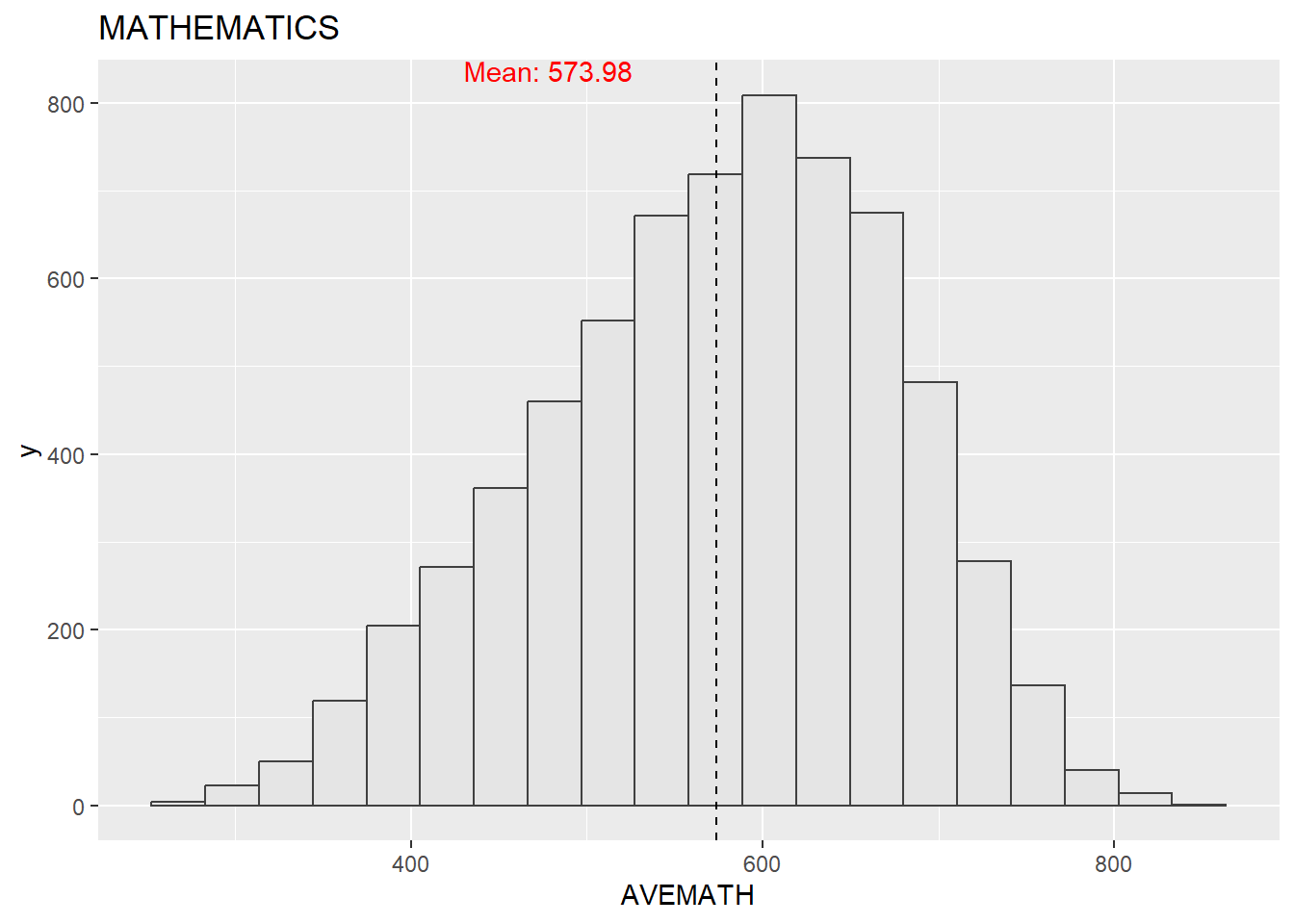
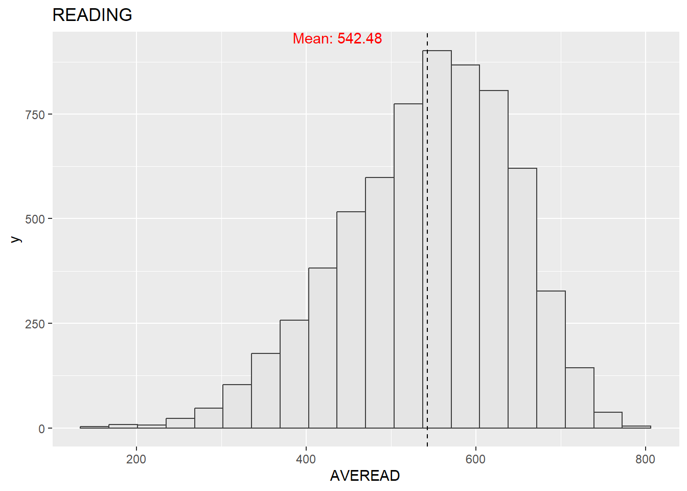
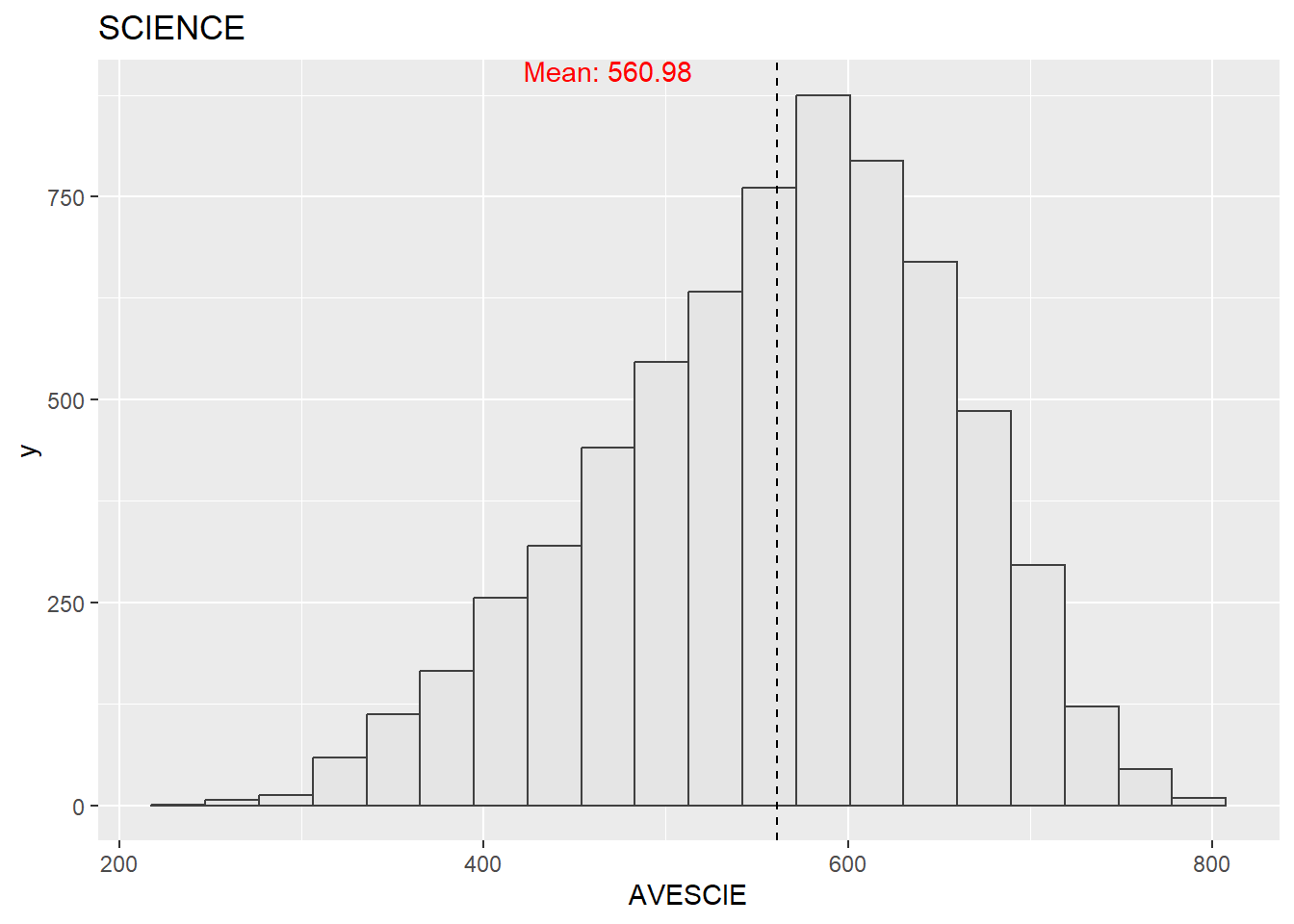
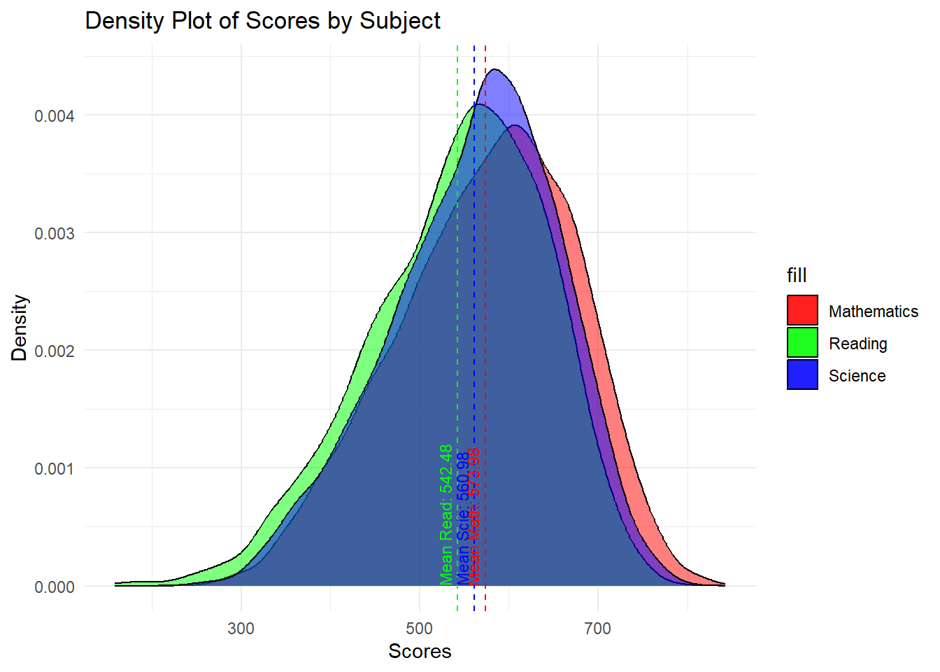
Before doing any further analysis, it is always good to look at the distribution of the data, so we can look at the distribution of the three subjects using histograms.
mean_math <- mean(stu_qqq_SG_MRS$AVEMATH, na.rm = TRUE)
mean_read <- mean(stu_qqq_SG_MRS$AVEREAD, na.rm = TRUE)
mean_scie <- mean(stu_qqq_SG_MRS$AVESCIE, na.rm = TRUE)

p1 <- ggplot(data=stu_qqq_SG_MRS,
             aes(x = AVEMATH )) +
  geom_histogram(bins=20,
                 boundary = 100,
                 color="grey25",
                 fill="grey90") +
  geom_vline(xintercept = mean_math, color = "black", linetype = "dashed")+
  annotate("text", x =mean_math, y = Inf, label = paste("Mean:", round(mean_math, 2)), vjust = 1, hjust = 1.5, color = "red") +
  theme_gray() +
  ggtitle("MATHEMATICS")

p2 <- ggplot(data=stu_qqq_SG_MRS,
             aes(x = AVEREAD )) +
  geom_histogram(bins=20,
                 boundary = 100,
                 color="grey25",
                 fill="grey90") +
  geom_vline(xintercept = mean_read, color = "black", linetype = "dashed")+
  annotate("text", x =mean_read, y = Inf, label = paste("Mean:", round(mean_read, 2)), vjust = 1, hjust = 1.5, color = "red") +
  theme_gray() +
  ggtitle("READING")

p3 <- ggplot(data=stu_qqq_SG_MRS,
             aes(x = AVESCIE )) +
  geom_histogram(bins=20,
                 boundary = 100,
                 color="grey25",
                 fill="grey90") +
  geom_vline(xintercept = mean_scie, color = "black", linetype = "dashed")+
  annotate("text", x =mean_scie, y = Inf, label = paste("Mean:", round(mean_scie, 2)), vjust = 1, hjust = 1.5, color = "red") +
  theme_gray() +
  ggtitle("SCIENCE")

p4 <- ggplot(stu_qqq_SG_MRS) +
  geom_density(aes(x = AVEMATH, fill = "Mathematics"), alpha = 0.5) +
  geom_density(aes(x = AVEREAD, fill = "Reading"), alpha = 0.5) +
  geom_density(aes(x = AVESCIE, fill = "Science"), alpha = 0.5) +
  geom_vline(xintercept = mean_math, color = "red", linetype = "dashed") +
  geom_vline(xintercept = mean_read, color = "green", linetype = "dashed") +
  geom_vline(xintercept = mean_scie, color = "blue", linetype = "dashed") +
  annotate("text", x = mean_math, y = 0, label = paste("Mean Math:", round(mean_math, 2)), hjust = 0, color = "red", size = 3, angle = 90, vjust = -0.5) +
  annotate("text", x = mean_read, y = 0, label = paste("Mean Read:", round(mean_read, 2)), hjust = 0, color = "green", size = 3, angle = 90, vjust = -0.5) +
  annotate("text", x = mean_scie, y = 0, label = paste("Mean Scie:", round(mean_scie, 2)), hjust = 0, color = "blue", size = 3, angle = 90, vjust = -0.5) +
  ggtitle("Density Plot of Scores by Subject") +
  xlab("Scores") +
  ylab("Density") +
  scale_fill_manual(values = c("Mathematics" = "red", "Reading" = "green", "Science" = "blue")) +
  theme_minimal()
The mathematics, reading, and science scores conform to a normal distribution. Since we are not analyzing data from other countries, there is no basis for comparison, which means we can only say that this is a set of normal data with no apparent anomalies. And from the graphs, we could see that for students performance in three subjects,math has the greatest average mean among three courses, and the next up higher is science. Reading the lowest.
Gender Relationship with Subject Scores
In this section the relationship of gender with different subjects will be analysed.
stu_qqq_SG_MRS_filtered <- stu_qqq_SG_MRS %>%
filter(ST004D01T == 1 | ST004D01T == 2)
mean_label <- function(x) {
return(as.character(round(mean(x, na.rm = TRUE), 2)))
}
formatted_mean <- function(x) {
sprintf("%.2f", mean(x, na.rm = TRUE))
}
offset <- 5 # Adjust this value as needed for your data
p4 <- ggplot(data = stu_qqq_SG_MRS_filtered, aes(y = AVEMATH, x = factor(ST004D01T), fill = factor(ST004D01T))) +
geom_boxplot() +
scale_x_discrete(labels = c("Female", "Male")) +
stat_summary(geom = "point", fun = mean, color = "red", size = 3) +
geom_text(aes(label = formatted_mean(AVEMATH)), y = mean_math + offset, color = "black", vjust = -1.5, size = 3) +
ggtitle("F vs M in Math") +
guides(fill=FALSE) # This removes the legend for fill
p5 <- ggplot(data = stu_qqq_SG_MRS_filtered, aes(y = AVEREAD, x = factor(ST004D01T), fill = factor(ST004D01T))) +
geom_boxplot() +
scale_x_discrete(labels = c("Female", "Male")) +
stat_summary(geom = "point", fun = mean, color = "red", size = 3) +
geom_text(aes(label = formatted_mean(AVEREAD)), y = mean_read + offset, color = "black", vjust = -1.5, size = 3) +
ggtitle("F vs M in Read") +
guides(fill=FALSE) # This removes the legend for fill
p6 <- ggplot(data = stu_qqq_SG_MRS_filtered, aes(y = AVESCIE, x = factor(ST004D01T), fill = factor(ST004D01T))) +
geom_boxplot() +
scale_x_discrete(labels = c("Female", "Male")) +
stat_summary(geom = "point", fun = mean, color = "red", size = 3) +
geom_text(aes(label = formatted_mean(AVESCIE)), y = mean_scie + offset, color = "black", vjust = -1.5, size = 3) +
ggtitle("F vs M in Scie") +
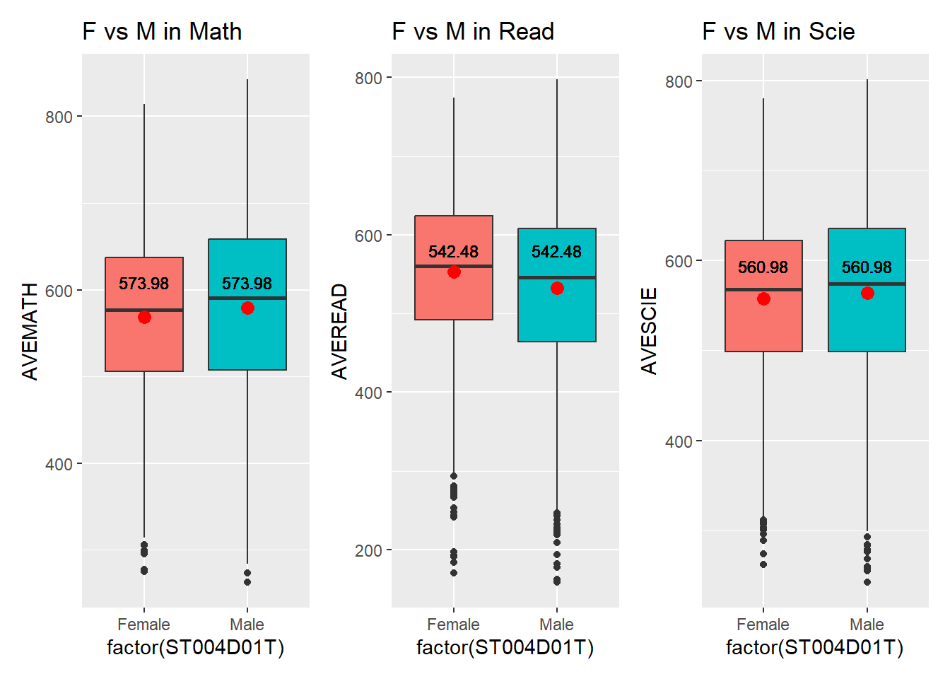
guides(fill=FALSE) # This removes the legend for fillThe boxplot reveals only minor differences between females and males. Males perform slightly better than females in mathematics, while females outperform males in reading. In science, the mean scores are nearly identical.
Socioeconomic Status Relationship with Subject Scores
Next take a look at the Socioeconomic status relationship with different subject scores.
cor1 <- round(cor(stu_qqq_SG_MRS$AVEMATH, stu_qqq_SG_MRS$ESCS, use = "complete.obs"), 2)
cor2 <- round(cor(stu_qqq_SG_MRS$AVESCIE, stu_qqq_SG_MRS$ESCS, use = "complete.obs"), 2)
cor3 <- round(cor(stu_qqq_SG_MRS$AVEREAD, stu_qqq_SG_MRS$ESCS, use = "complete.obs"), 2)
if (!is.na(cor1) && !is.na(cor2) && !is.na(cor3)) {
p7 <- ggplot(data = stu_qqq_SG_MRS, aes(y = AVEMATH, x = ESCS)) +
geom_point(size = 0.1) +
geom_smooth(method = lm) +
annotate("text", x = 2.5, y = 600, label = paste0("r = ", cor1), color = 'blue') +
theme_minimal()
p8 <- ggplot(data = stu_qqq_SG_MRS, aes(y = AVESCIE, x = ESCS)) +
geom_point(size = 0.1) +
geom_smooth(method = lm) +
annotate("text", x = 2.5, y = 600, label = paste0("r = ", cor2), color = 'blue') +
theme_minimal()
p9 <- ggplot(data = stu_qqq_SG_MRS, aes(y = AVEREAD, x = ESCS)) +
geom_point(size = 0.1) +
geom_smooth(method = lm) +
annotate("text", x = 2.5, y = 600, label = paste0("r = ", cor3), color = 'blue') +
theme_minimal()
} else {
cat("Correlation could not be calculated due to insufficient complete cases.")
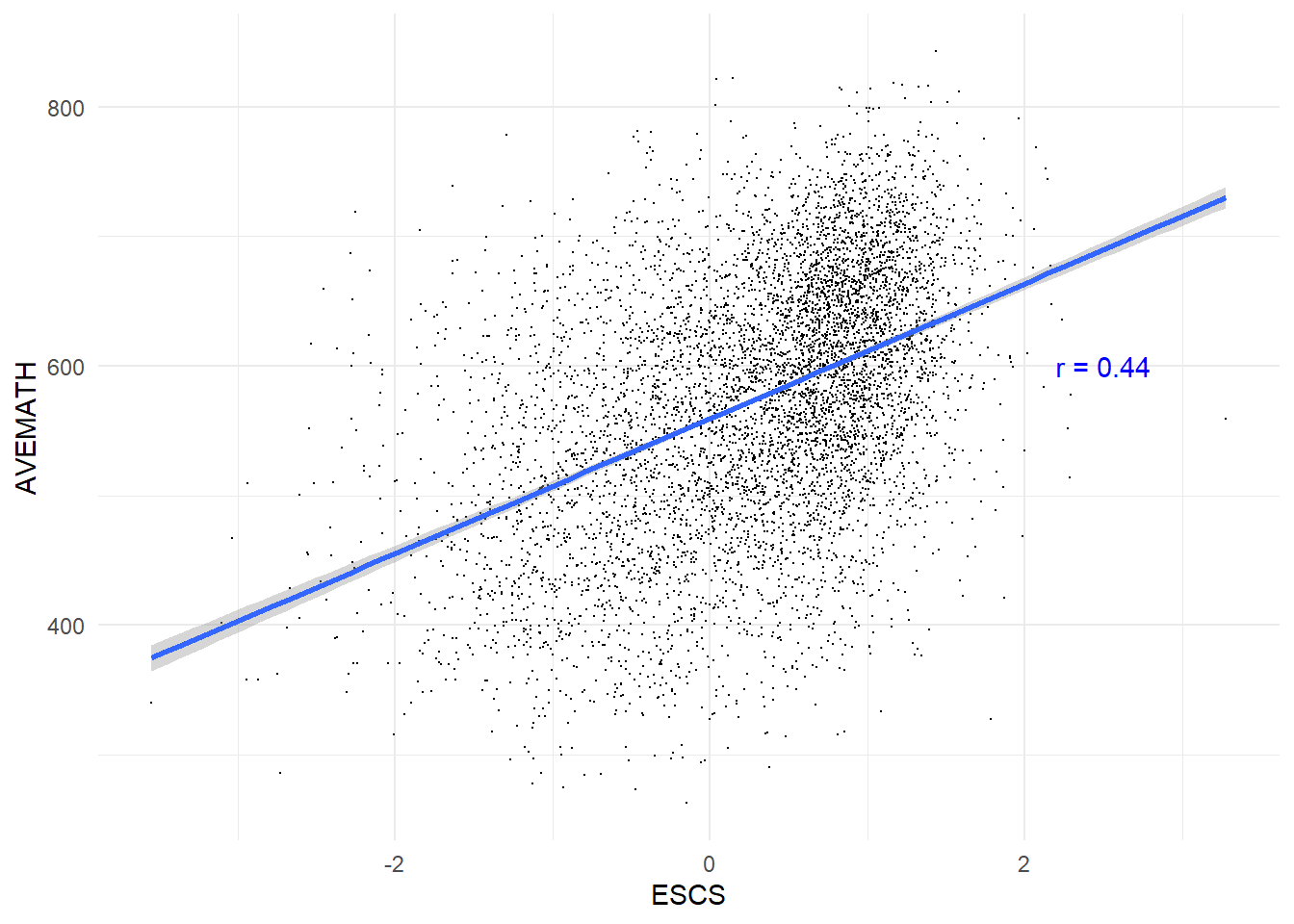
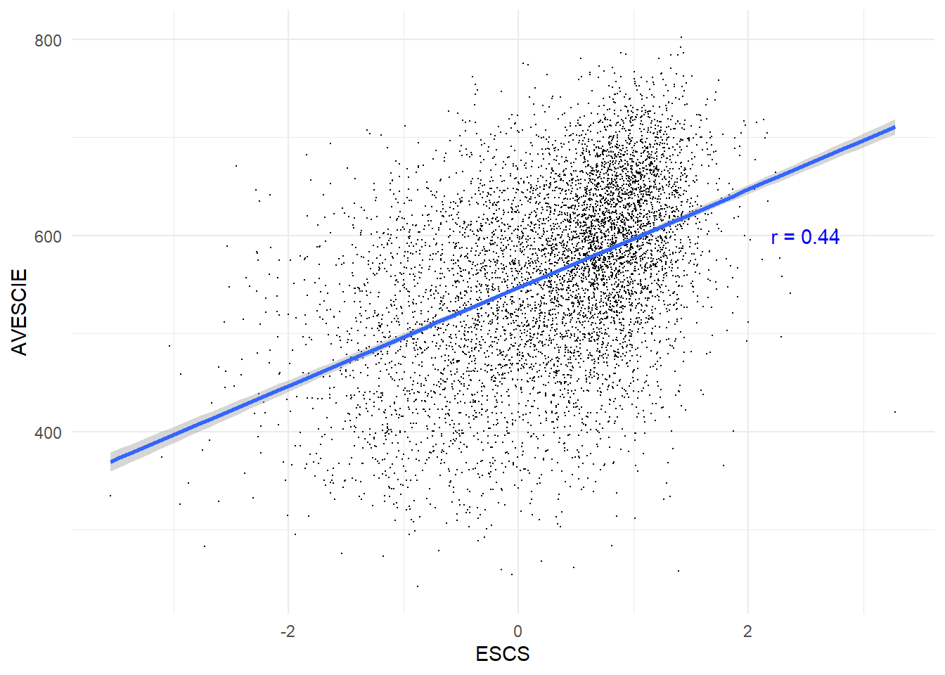
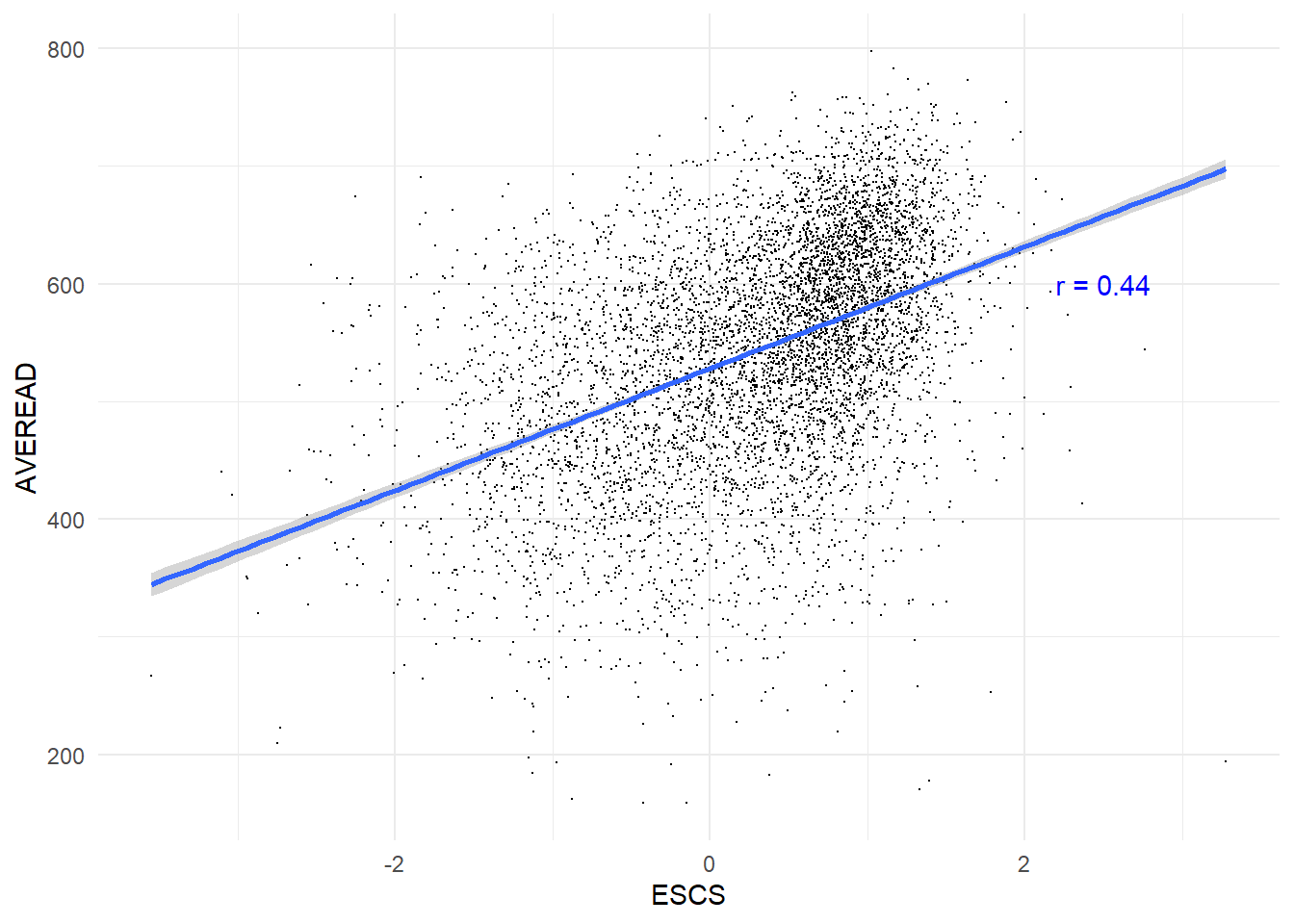
}The scatter plots demonstrate a dispersion across all socioeconomic levels, yet they reveal a consistent trend: the correlations between socioeconomic status and academic performance in all subjects are approximately 0.44. This indicates a modest yet positive relationship. Consequently, it can be inferred that students from higher socioeconomic backgrounds tend to achieve higher scores.
Schools Relationship with Subject Scores
Lastly, we analyse the relationship between different schools in singapore with subject scores.
school_averages <- stu_qqq_SG_MRS %>%
group_by(CNTSCHID) %>%
summarise(
Average_AVEMATH = mean(AVEMATH, na.rm = TRUE),
Average_AVEREAD = mean(AVEREAD, na.rm = TRUE),
Average_AVECIE = mean(AVESCIE, na.rm = TRUE)
)
school_averages_long <- school_averages %>%
pivot_longer(
cols = starts_with("Average_"),
names_to = "Subject",
values_to = "Average_Score"
)
outliers_threshold <- function(data, var) {
Q1 <- quantile(data[[var]], 0.25, na.rm = TRUE)
Q3 <- quantile(data[[var]], 0.75, na.rm = TRUE)
IQR <- Q3 - Q1
lower <- Q1 - 1.5 * IQR
upper <- Q3 + 1.5 * IQR
data %>% filter((data[[var]] < lower) | (data[[var]] > upper))
}
outliers_data <- school_averages_long %>%
group_by(Subject) %>%
do(outliers_threshold(., "Average_Score"))
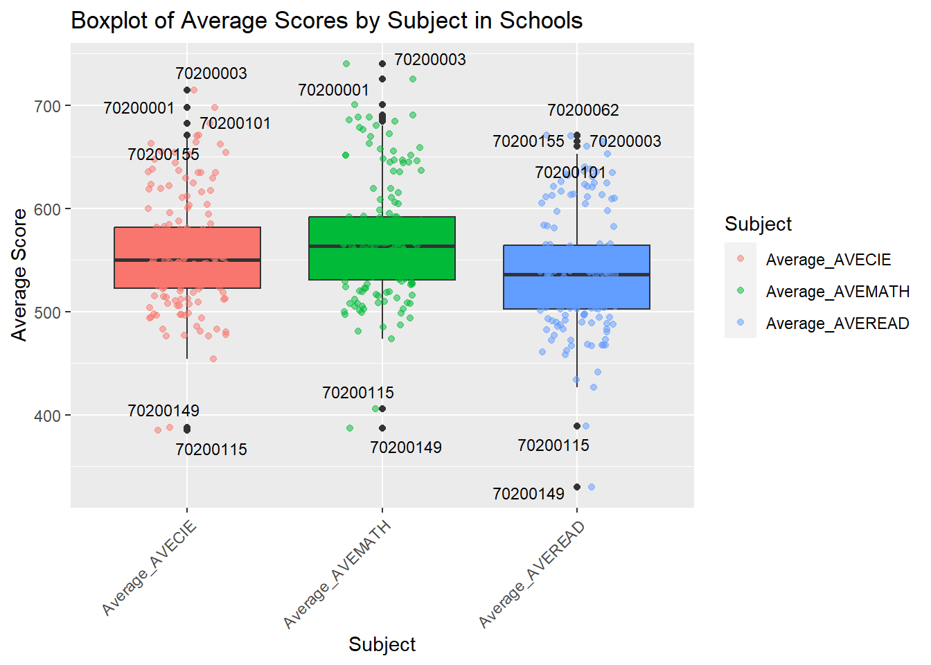
p10 <- ggplot(school_averages_long, aes(x = Subject, y = Average_Score, fill = Subject)) +
geom_boxplot() +
geom_point(aes(color = Subject), position = position_jitter(width = 0.2), alpha = 0.5) +
labs(title = "Boxplot of Average Scores by Subject in Schools", x = "Subject", y = "Average Score") +
theme(axis.text.x = element_text(angle = 45, hjust = 1)) +
geom_text_repel(
data = outliers_data,
aes(label = CNTSCHID),
box.padding = 0.35,
point.padding = 0.5,
segment.color = "grey50",
size = 3,
max.overlaps = 10
) +
guides(fill = "none")
p10The boxplot visualizes the distribution of average scores in Science, Mathematics, and Reading across various schools, revealing a similar median score for each subject but with Science showing a greater variability in performance. Outliers marked with school IDs suggest significant deviations from the norm, with some schools achieving notably higher or lower scores, potentially indicating disparities in educational quality, resource allocation, or socioeconomic factors affecting student performance. Identifying and understanding the underlying reasons for these outliers could be key to informing educational improvements and policies.